
Testing mock-ups
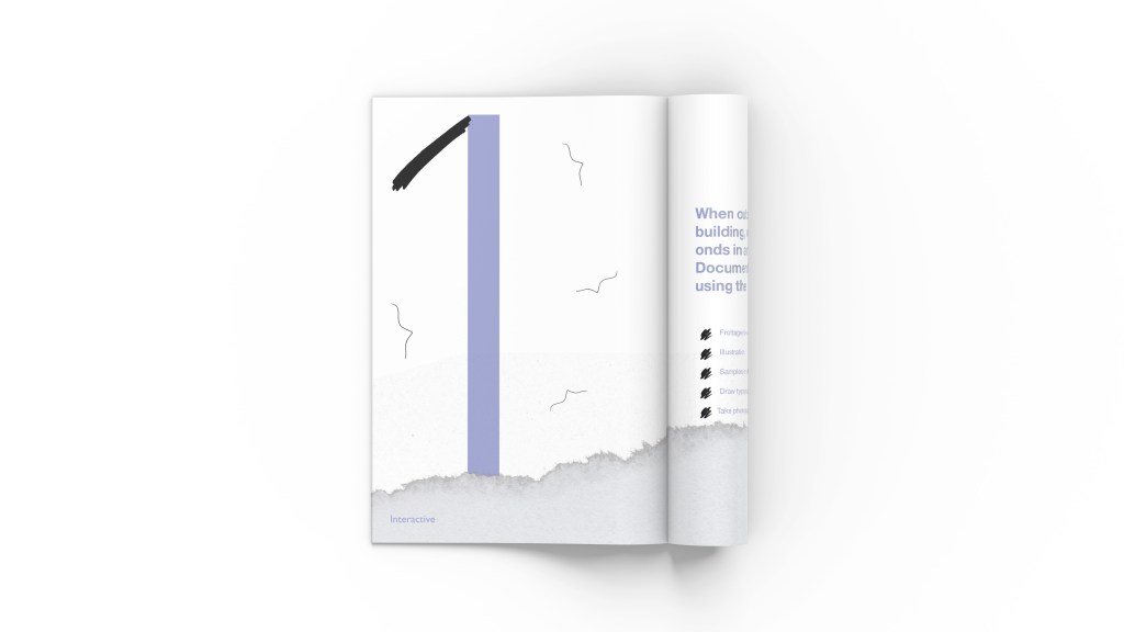
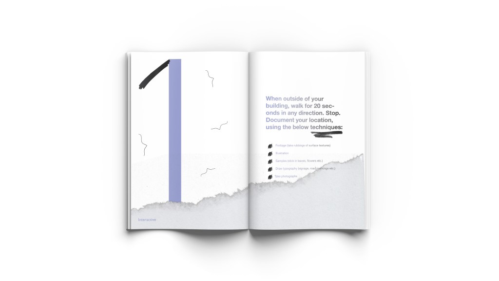
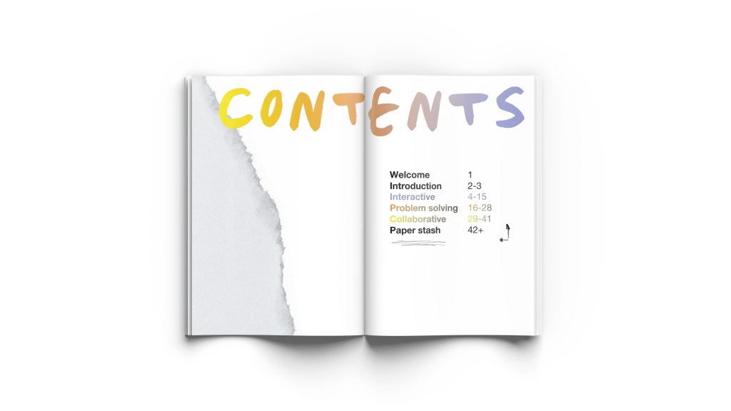


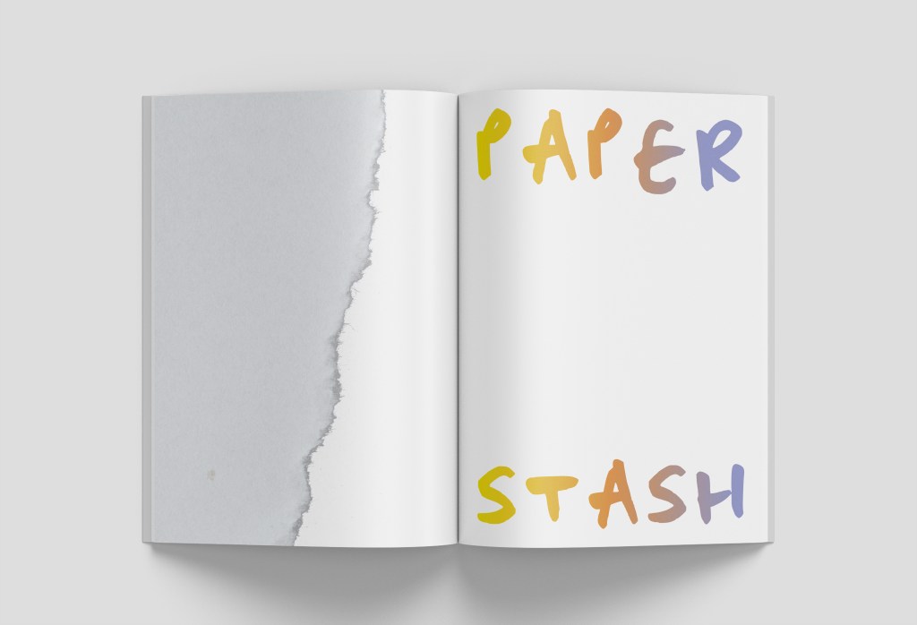
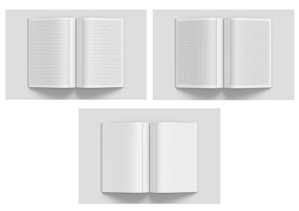
I wanted a mock-up to demonstrate tear-out pages so think two examples works nicely below – as the viewer you can see the tear-out line clearer and also how the type is arranged to allow for the previous page to not interfere with any cut-out letters:

Risograph
In week 10 I mentioned how I wanted to research Risograph (which I did here) but I want to consider printing the outcome using this process and therefore display it this way. Using this link I have found some techniques to test out –
• The left page is Filter > Noise > 14% and Gradient > yellow: R242/G229/B60 and orange: R225/G141/B60 (my colours I have used for the branding) combined
• The right page is converting image to Grayscale, then back to RGB (which makes a halftone dot effect) and then applying a gradient overlay as above but in orange and purple (R141/G149/B202)
This was a valuable experiment as I wanted to consider an ethical way of printing further for my workshop brochure, however I soon realised that all of the contrasting black text was what made the colours ‘pop’ on the page due to contrast and without it, it looks quite dull. It doesn’t present the energetic, playful vibe anymore – it looks more like a document. In fact, it looks digital and this is what I want to steer away from. So I am glad I tried considering risograph as my final outcome but I will have to stick with regular printing. There’s nothing to say that eco-friendly inks can’t be used during the regular printing (laser) process, so I would definitely consider this when doing batches for workshops. I’d also consider the paper it’s printed on, and use recycled/recyclable paper for these brochures.
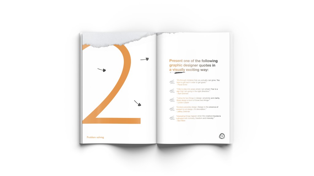
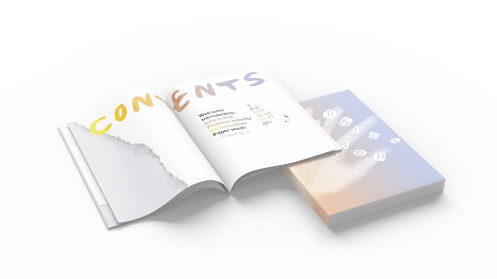
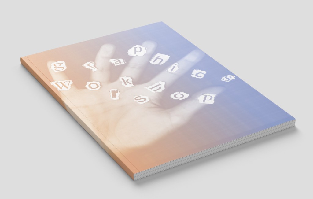
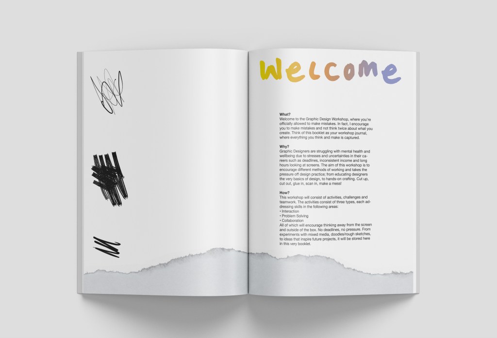
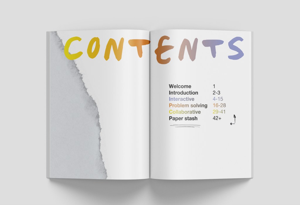
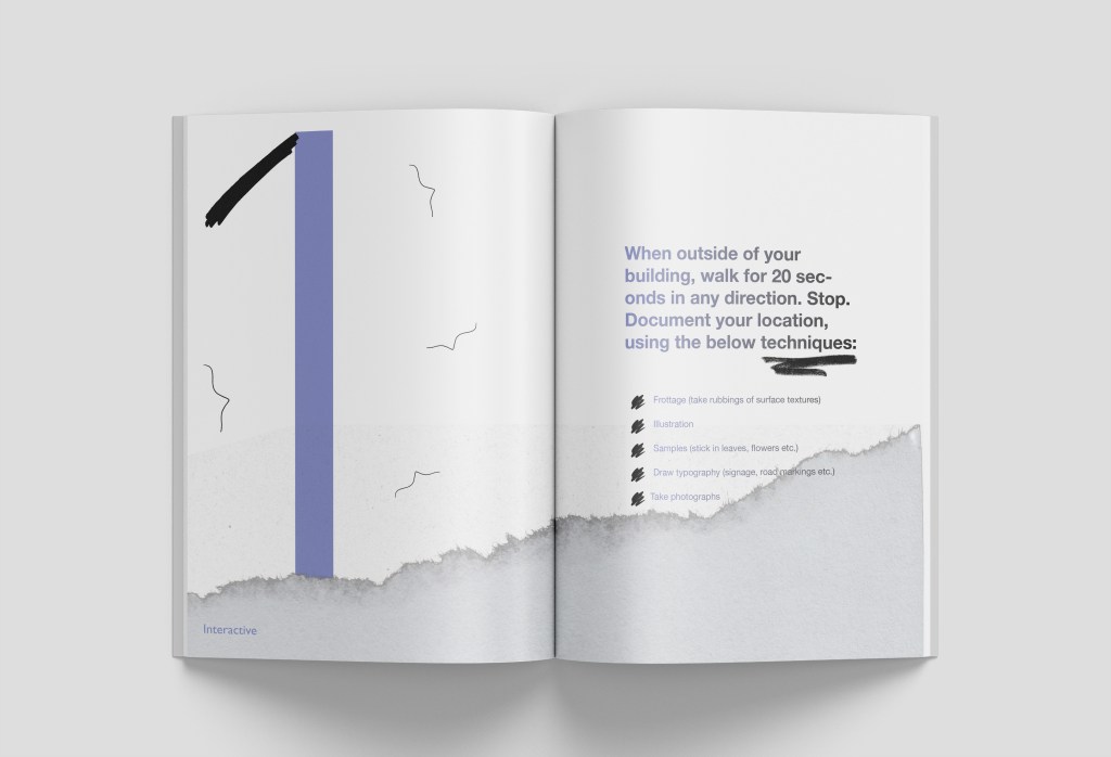
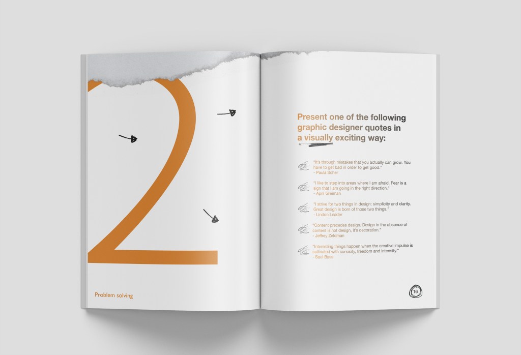
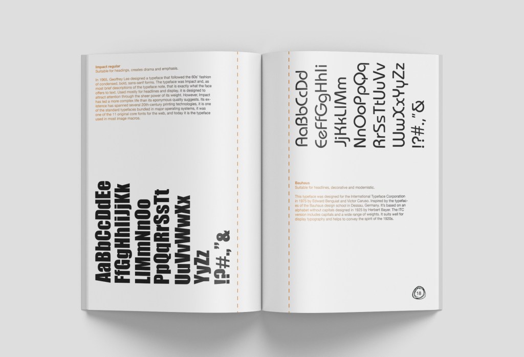
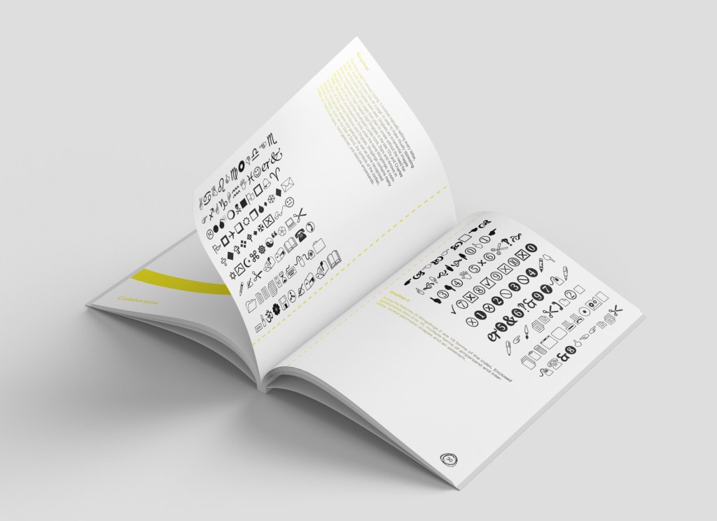
Final mock ups
Verdict
Strengths
• The overall concept where the workshop brochure is a combination of a journal and educational analogue tool, reuniting designers with craft and getting them away from the screen
• The colour scheme works well as it contrasts really nicely with the black
• Introducing my own freehand details gives it that edge which hints at hand drawing, scribbles and playful experiments
Weaknesses
• There is a lot of white space on the page; arguably that is to encourage creativity very much like the journals I researched where it’s down to the individual to be creative and fill up their pages with craft
Opportunities
• The idea of a workshop being a community of people, and these designers going home after the course and having this ongoing workshop brochure as something to inspire them – so how could I encourage this? Maybe an app or social media where you can upload your continued progress with a photo and hashtag?
Threats
• Traditional classroom based activities however the issue I have found from personal experience is so much waste. This brochure eliminates the excessive use of waste and doubles up as not only a workshop journal, but as a souvenir and guide after the workshop to take home and further develop. You wouldn’t be able to do this with current classroom based activities as teachers/tutors would have all of the guidance for pupils to complete tasks
• I mentioned in week 6 a pricing plan and offering a reasonable price for the workshops. People may be more willing to further study but that comes at a very high cost, my workshop would be far more reasonable and actively encourage self-initiated project development.
