
Reference Material
Astrid Stavro
- How paths connect to build bigger picture
- Life is a journey not a destination
- Books by her father, printed and published
- Travelled all across Europe as a family
- Drawing wasn’t her cup of tea, so turned to words
- Studied literature and philosophy, loved reading. Best teachers were the authors of books read
- Alan Kitching and screen print
- Formed graphic design studio
James Curleigh
- Professional deja vu
- Consumerism – more choice than ever
- Generation C generation connected
- The rate of change, landscape is changing
- “Inverted synergy – the whole is less than the sum of its parts” – Levi’s jeans have made jeans but branched out to other clothing which has made the brand successful
Made Thought
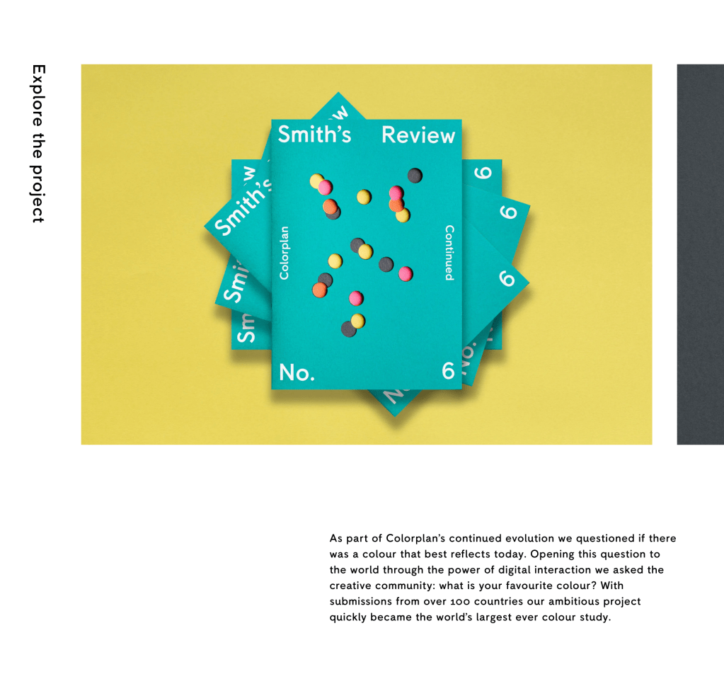
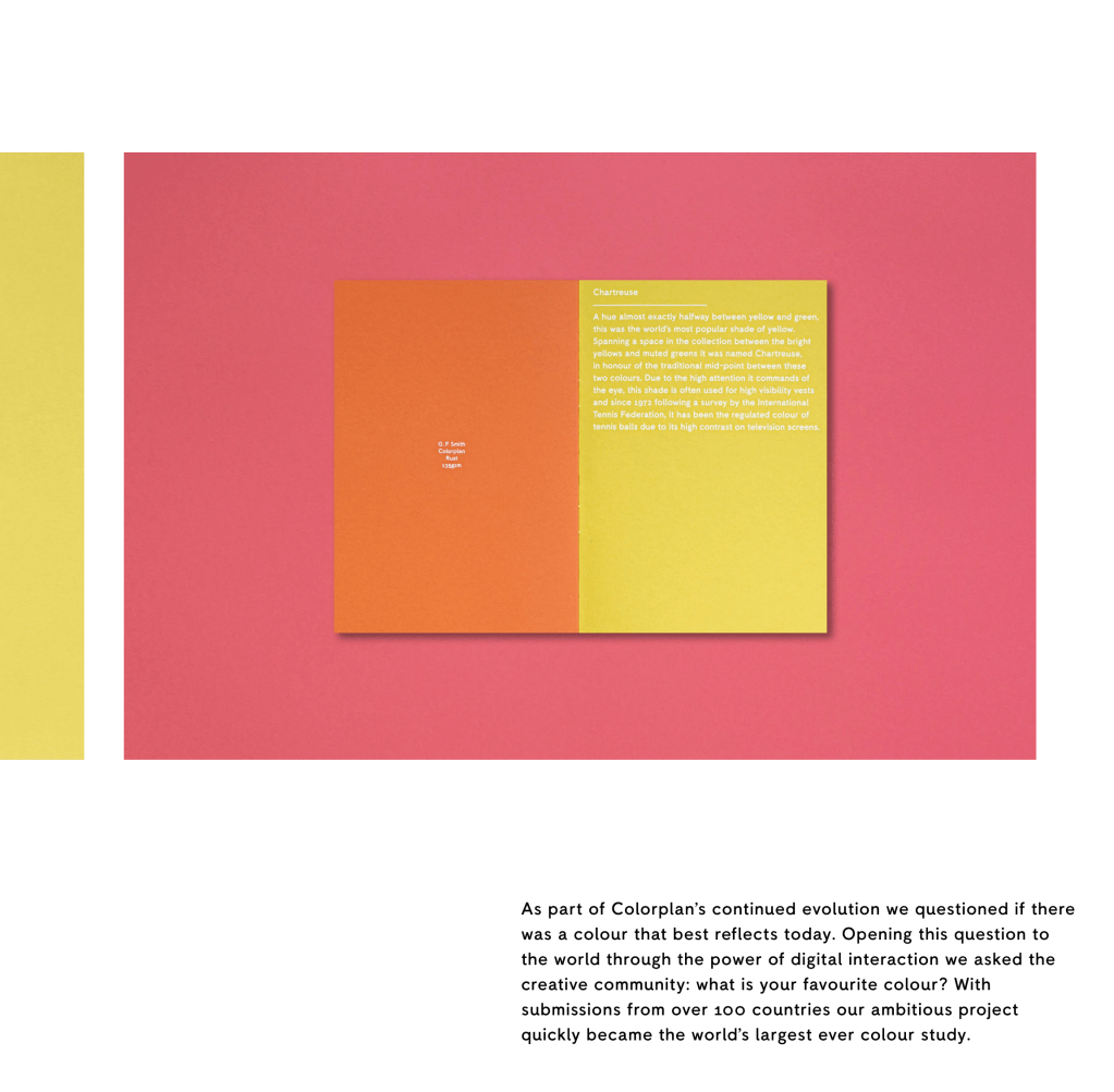
- World’s most favourite colour video G F Smith
- A new colour – interactive website where people can ‘mix’ their own colour and submit their favourite colour
- Beautiful dot data of all submissions!
- Next step was to identify ‘who’ actually voted and why, getting statistics i.e. 2x more women voted than men
- Teal was the favourite colour, Slate, Orange, Yellow and Pink were also popular – ‘Smith’s Review’ documented this:

The Making of Mars Green
I loved watching how the paper was made (video on the site here) and the images accompanying it below are really beautiful – the process and textures are what makes the development of this project so interesting:


- Pointillism and colour grouping; zooming in close you can see many colours but from afar it looks like one colour
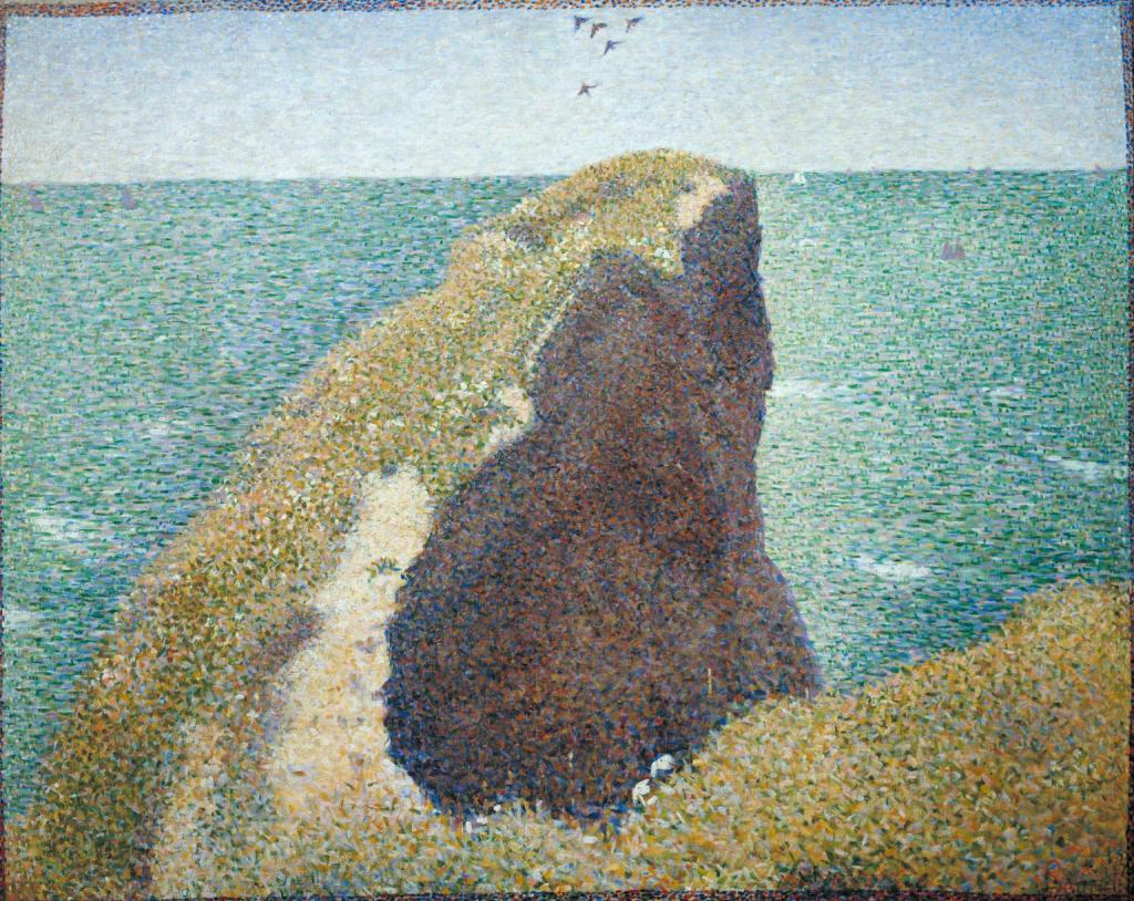
Le Bec du Hoc, Grandcamp 1885 Georges Seurat 1859-1891 Source
- Associating things with colour; interesting how ‘create’ ‘creative’ and ‘art’ all came up as three different colours. Two different shades of purple for ‘quality’ and ‘elegance’ so some similarities. The future is mint green…
- Dusk vs twilight, colours of oceans vs colours of lakes, trees vs forest, colours of quiet vs loud, strong vs confident etc.
- The colours of fashion, sustainability, beauty, not for profit
- G F Smith colour report
I really enjoyed this lecture as it fits in well with my interests in the colour wheel that I have tried to incorporate into most of my projects at this point (even if just based in research). Psychology in colour has always interested me and even more so after watching this lecture – it was fascinating to see how the public voted ‘things’ as colours and how some colours were really similar; yet different. ‘Calm’ and ‘calming’ were the same shade of light sky blue, but one was lighter than the other for instance. What I also loved about this project is how it begun with one toolkit (a website where people can vote publicly) to a huge project that just branched out into several interesting directions. The final colour outcome ended up being involved in a project in itself, where 10,000 paper aeroplanes coloured in ‘Marrs Green’ were included in the Paper City exhibition.
DixonBaxi
- 75% international work, in any given day about 2 billion people see their work
- Half the team are international, diverse, truthful and authentic
- “Fear is good”, promote that feeling
- Don’t work with negativity as it will impact work
- Great relationship with clients and great work, they will be challenging you and vice versa, asking why will get to the root of the idea
- Clients are part of their process, pop out studio in their office, touch it, argue about it etc, will generate a great outcome
- Eurosport identity, capturing moments and movement, passion, snippets of fans, the athletes and the important moments
- Storytelling, a narrative. People will remember it. Making a video of all of the factors in these athletes determination, (eat, sleep, train, repeat, also pain which was interesting and truthful, as important to consider success doesn’t come without hard work) which helped put them in the zone to create the identity for Eurosport
- Olympic typeface
- Validate the beauty and craft of graphic design to make the client understand how it works
- Making difficult choices and making sure ethics are considered, including having to leave clients if they don’t bring anything to the table, moving on and making hard decisions as a studio is important for growth
- Go places, see things, travel, generate positive energy and a fresh perspective to bring back to the studio and apply to the work
- Don’t do things just for money. Do it because you are proud of it, and enjoy it, otherwise you’ll fall into an endless cycle. Invigorate that passion
I thought this lecture was really well delivered, well structured, and presented a great insight into the operations of running a studio and keeping it running successfully. There are a number of points above that I resonate with; not doing work simply for the money being one. Creative work should 100% be something you are passionate about or at the very least get excited about. I really valued them discussing how they make difficult choices in the studio; rejecting large projects for ethical reasons and handing over clients to friends when they no longer feel best suited to work for them. I picked up on the mention of being truthful in the beginning of the talk and I really got the impression throughout that DixonBaxi are transparent in their practice, even if it means going with head over heart and knowing what the right thing to do morally is. This studio have got quite a lot of experience at this point; and it shows. They’re at a point where they can afford to be choosy with clients, I do have to question whether an upcoming, young studio would have the luxury to turn down a big project if it didn’t align with their principles. I suppose this is what makes a good studio though, is factoring these elements into the business regardless of length of experience.
