
NATURE FOR INSPIRATION – BRECON BEACONS:
I have been thinking about waterfalls, and how I could look at pictures of them for reference – Brecon Beacons (not far from where my parents live back in Wales) have some spectacular waterfalls when there’s heavy rain.
I have collected some images that I found off google as reference:
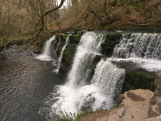
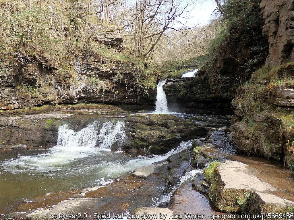
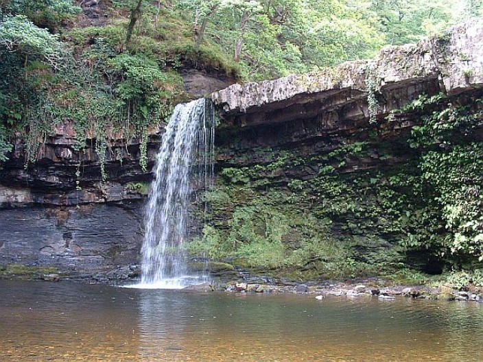
There are many stages in a waterfall – the serenity and calm before tipping over the edge of rocks and then plummeting downwards. The water also begins to transform into a mist before hitting the surface below due to water vapour, and splashes of water hit the surrounding area of the pool below.
Waterfalls have stories – the water has a history, has travelled (often from from afar) and encounters many bumps along the way. There’s something really serene about comparing this to life. A person has a history, and each individual has a journey they take that leads to where they want to be. There are bumps, there’s tough decisions and this all makes us who we are.
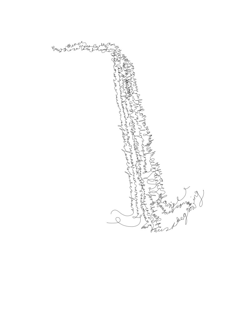
Therefore, presenting the Roald Dahl poem through a visual layout of water falling, and plunging to a pool below I feel is quite fitting for the meaning behind the poem; a poem exploring direction, fear and uncertainty.
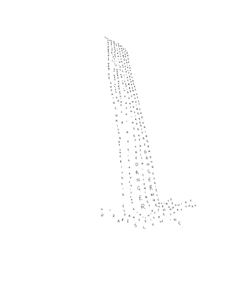
Mock-up using hand-drawn letters 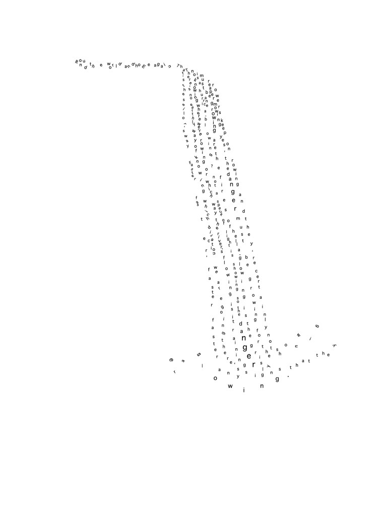
InDesign mock-up
Above, I have placed the individual letters quite spaced out at the pooling area of the waterfall. I’m not sure this looks as effective as it could be as I need to be thinking about the way the text sounds and not just how it looks.
The first line of text is tilted in various angles – I wanted to present a feel of the letters tumbling down the river all mixed up. As a whole, to read this line isn’t quite fitting with the waterfall text. I think it’s because the text is so spaced out in the waterfall, but really compacted in this line. I need to still make the text easy on the eyes, but also present a “calm before the storm” where the water goes from calm to sudden movement.
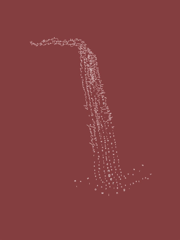
Further developing the above, I picked the outcome I felt worked best – the singular waterfall. I wanted to try the multiple waterfall idea as the concept sounded interesting, but as a final I think the singular waterfall has more intensity, very much like the poem/film portrays.
As a final piece, I decided something was missing and I wanted to test out the use of colour. I thought about using colours of earth, blue and green as these often represent adventure in branding identities:
The first line. 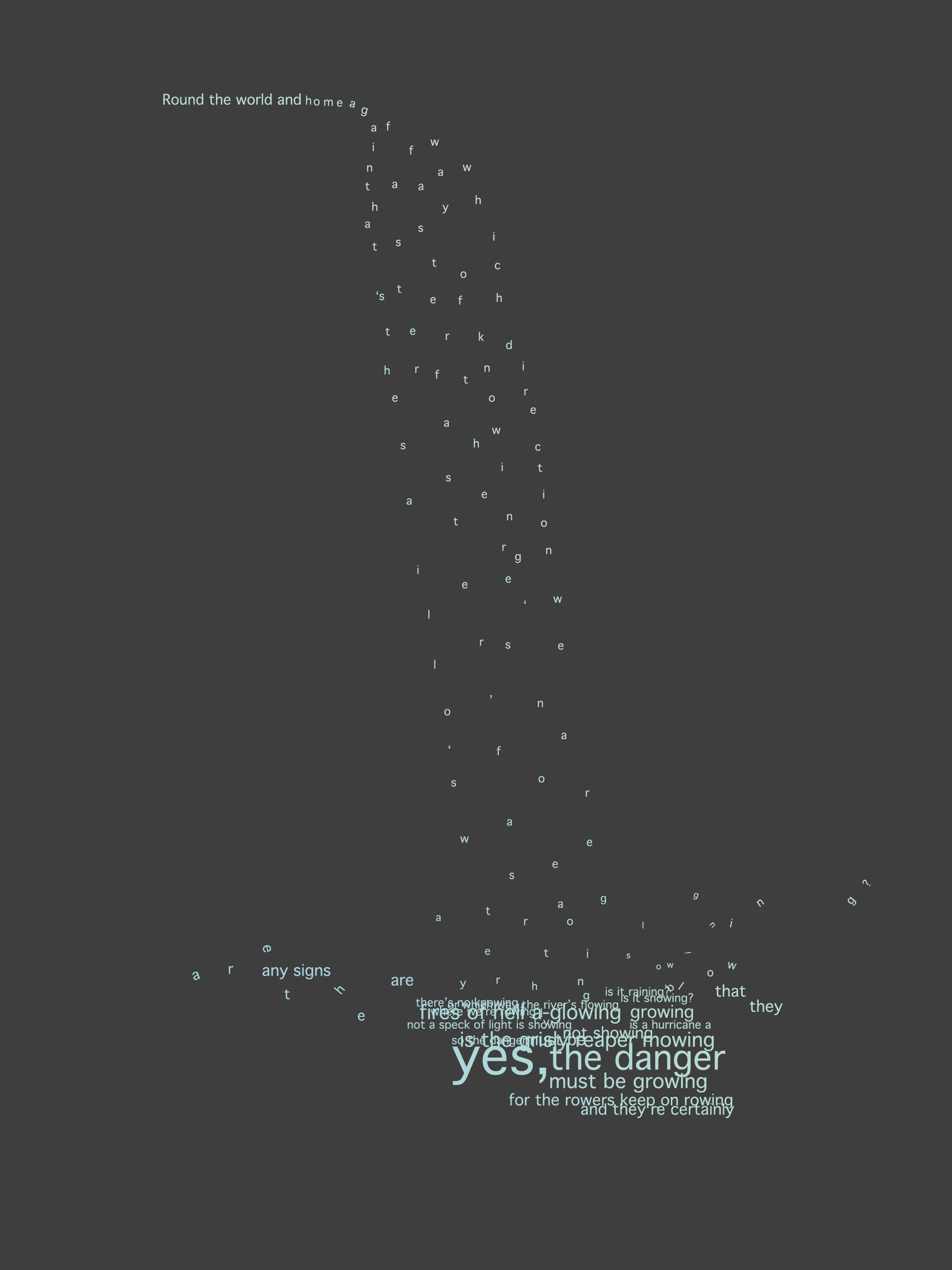
The final visual image before feedback.
Using a gradient of pastel green and blue was visually softer than two separate colours, and placing it on a darker background provides a good contrast with the typography.
Feedback:
From Sarah by email:
“Beautiful developments and iterations this week. I personally think number 2 is the most successful, and have also commented on the ideas wall that you could consider how to show the ‘constant’ flow. The idea is really simple and confident, however the final outcome lacks the movement and fluidity of your tests and experiments. These better represent what you are trying to communicate.
Great references on your blog, you are working hard. You can also consider how to exaggerate and add to the atmosphere and feeling of the text used by changing the format, a larger scale would allow for more dramatic negative space – you could look to photographs of waterfalls again to get the perspective correct.”
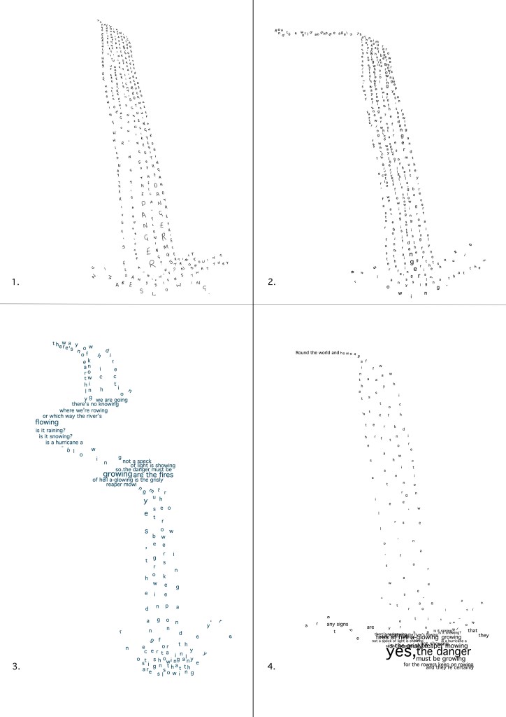
I am taking into consideration that the second waterfall has an introduction – “a flow” before the drop. In experiment number 2, I have tried to convey a sense of the letters ‘tumbling’ downstream before tipping over the edge in the fall. I want to explore how I could present this better.
Writing the poem in connected lines of my handwriting to represent flow. 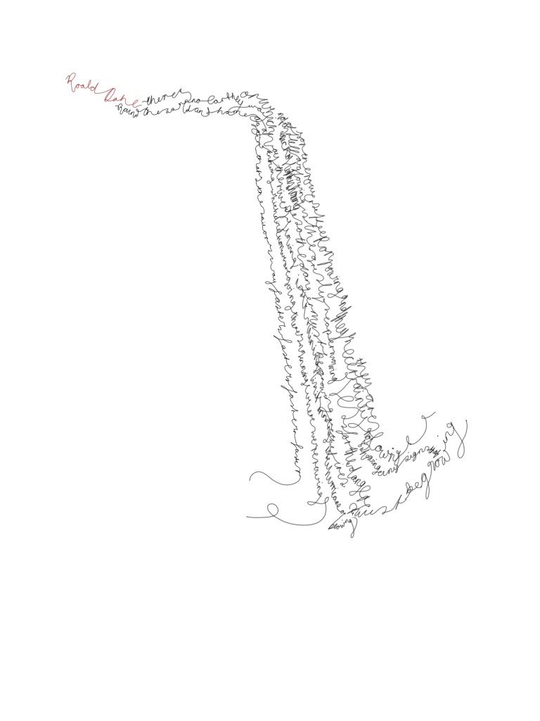
I tried incorporating the author into the ‘flow’ but felt it wasn’t needed. 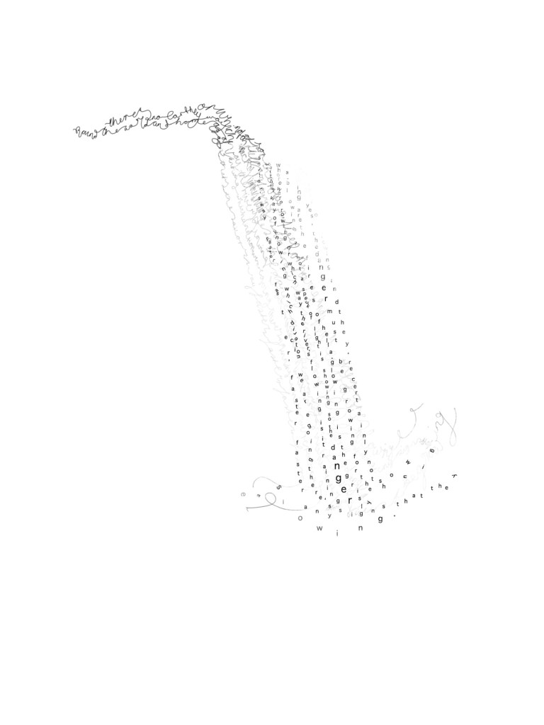
I have moved the layers but this isn’t as successful as the simplicity of the letters gets lost in distractions of lines. 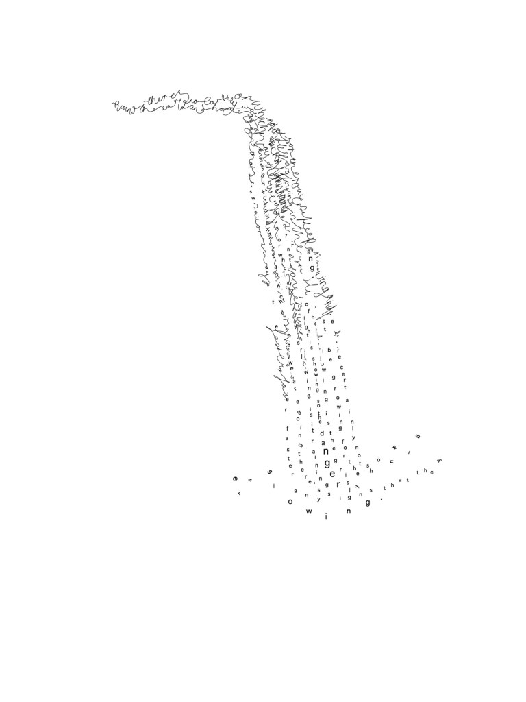
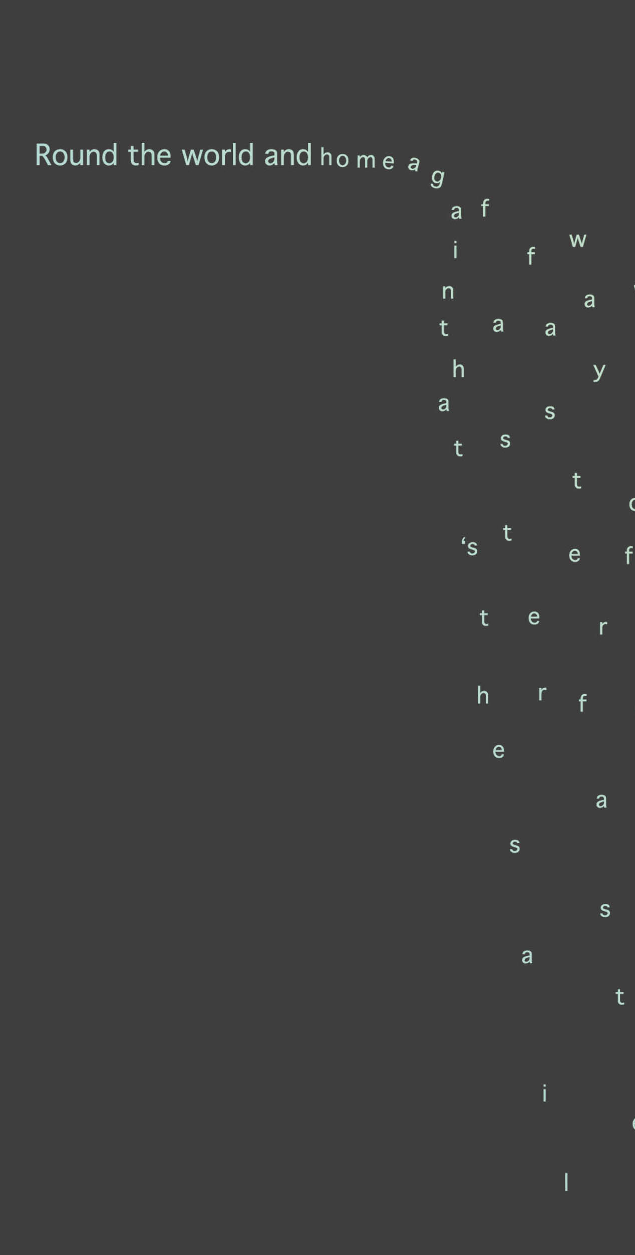
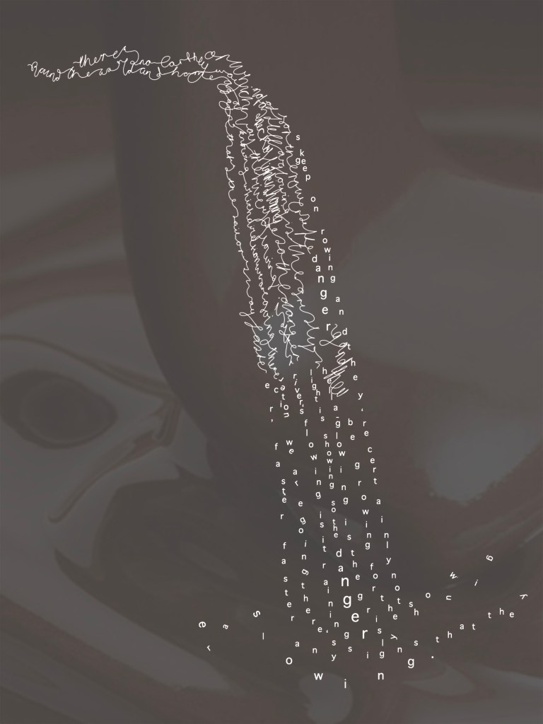
I’m happiest with this outcome – I layered the handwriting over the top of my original ‘tumbling’ (2) outcome and erased areas, creating an impression of flowing and the letters dispersing like water would at the bottom of the waterfall.
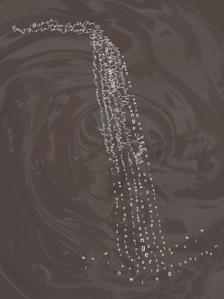
When reading the poem by Roald Dahl and watching the scenes I always felt scared. The poem itself is about danger, and darkness, and things moving very fast. I see this as red and therefore have used red in the final piece background:
Feedback from peer crit:
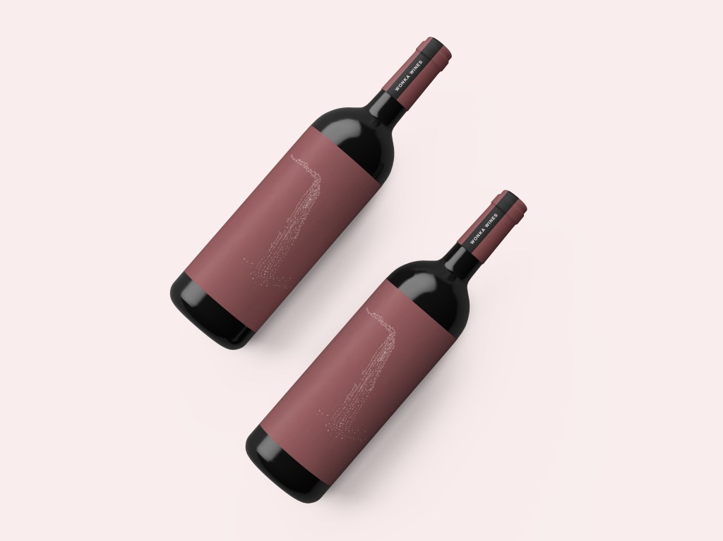
I made a mock-up of the design on “Wonka Wines”. The design gets lost when presented in a small format – I need to think larger scale so the words are readable and letters can be recognised.
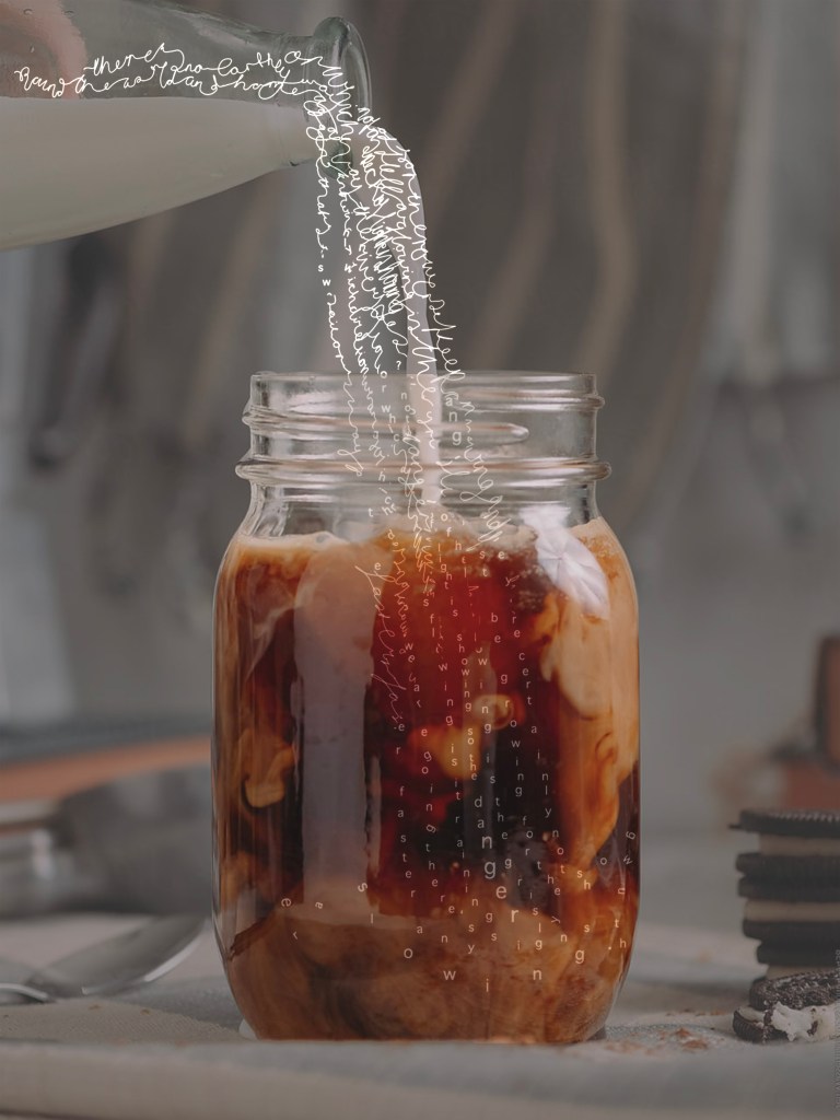
Considering the poem was from Charlie and the Chocolate Factory, I want to present the final with that in mind. I love the idea of using chocolate, with this design overlaid on the top. The text itself represents flow and direction.
Here are some experiments:
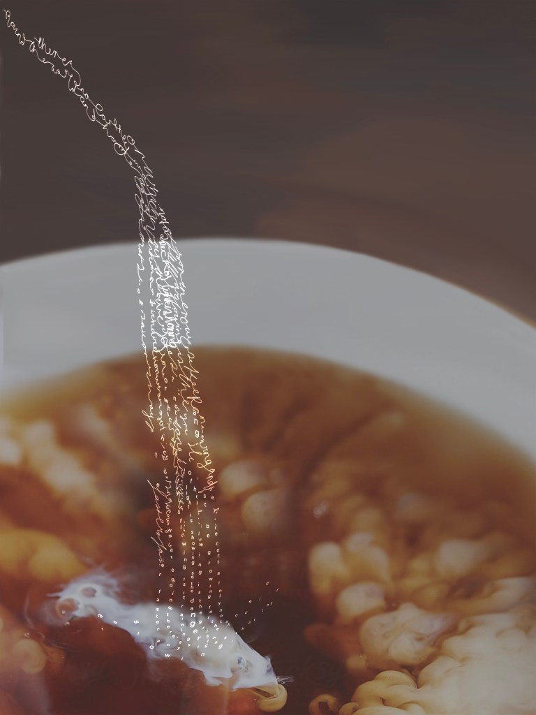
16% overlay 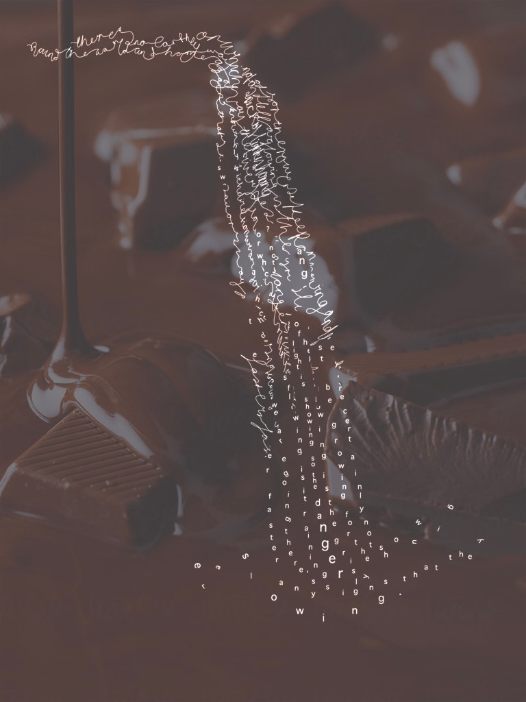
34% soft light
These experiments do not work as there is still too much detail in the background image. I need to think about making them simplified in the background so the text is overlaid on top.
