
Research for version #6 (previous page)
Risograph printing
I have been considering Risograph as a final output for my workshop brochure due to the following elements:
• Sustainability – the Riso machine uses vegetable based ink and the process keeps ink consumption very low
• I want experimental aspects to shine through in my design, and smudges, imperfections would only reinstate the message of ‘it’s ok to make mistakes’ and ‘it’s ok to fail’ – in order to succeed we (as designers) must make mistakes
• The finish – the layering aspect I think would be visually very effective alongside using a limited colour palette; I think my final colours would be black, orange, violet and yellow – perfect for Riso printing. Some examples of how the finish appears in print are on the Risotto studio shop here
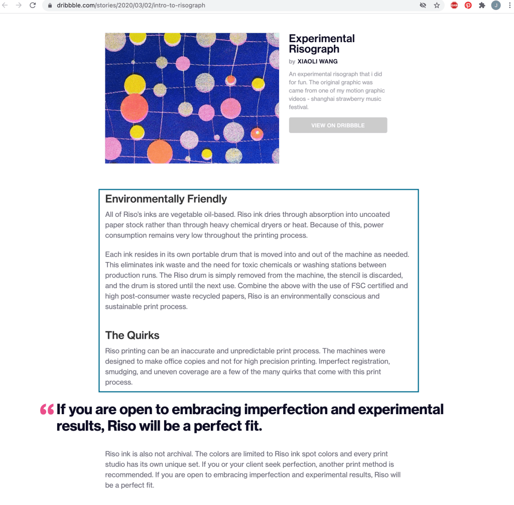
Image source
Learning more about the typeface examples I’ve used
Impact regular
Suitable for headings, creates drama and emphasis.
In 1965, Geoffrey Lee designed a typeface that followed the 60s’ fashion of condensed, bold, sans-serif forms. The typeface was Impact and, as most brief descriptions of the typeface note, that is exactly what the face offers to text. Used mostly for headlines and display, it is designed to attract attention through the sheer power of its weight. However, Impact has led a more complex life than its eponymous quality suggests. Its existence has spanned several 20th-century printing technologies, it is one of the standard typefaces bundled in major operating systems, it was one of the 11 original core fonts for the web, and today it is the typeface used in most image macros.
Bauhaus
Suitable for headlines, decorative and modernistic.
This typeface was designed for the International Typeface Corporation in 1975 by Edward Benguiat and Victor Caruso. Inspired by the typefaces of the Bauhaus design school in Dessau, Germany. It’s based on an alphabet without capitals designed in 1925 by Herbert Bayer. The ITC version includes capitals and a wide range of weights. It suits well for display typography and helps to convey the spirit of the 1920s.
Gill Sans regular
Suitable for bodies of text, a classic all-rounder.
Gill Sans was created in 1928 by the English sculptor, sign painter, type designer and wannabe social reformer Eric Gill. After a short stint as an apprentice to an architect, Gill attended the Central School of Arts and Crafts in London, where he studied lettering under calligrapher Edward Johnston (London Underground).The Gill Sans alphabet is classical in proportion. It is classified as a “humanist” sans serif, making it very legible and readable in text and display work. This makes it better suited than most sans serif typefaces to setting bodies of text.
Big Caslon
Suitable for headings, generally the larger the better.
Caslon is the name given to serif typefaces designed by William Caslon I (c. 1692–1766) in London, or inspired by his work. Caslon worked as an engraver of punches, the masters used to stamp the moulds or matrices used to cast metal type. He worked in the tradition of what is now called old-style serif letter design, that produced letters with a relatively organic structure resembling handwriting with a pen. Big Caslon is a Caslon revival typeface designed by Matthew Carter and released through Font Bureau in 1994. It was the first display size version of Caslon available digitally. Due to its high contrast, Big Caslon is intended for use at size 18 point or higher.
Bodoni 72
Suitable for bodies of text, a classic all-rounder.
First designed by Giambattisa Bodoni in 1798, Bodoni is generally considered a “transitional” font type. Bodoni was a prolific type font designer and this particular font was highly influenced by the work of John Baskerville, a designer whose work Bodoni followed. The font, with its highly recognisable centered “Q” tail and slight hook in the “J”, was widely accepted by printers and can be seen in a broad variety of publications and uses since the late 1700s. This typeface has been modified hundreds of times since its creation, with now new digital versions such as Bodoni Antiqua (Günter Gerhard Lange, 1935), Bodoni Old Face (H. Berthold 1983) and ITC Bodoni (Sumner Stone, 1994).
Helvetica
Suitable for bodies of text, a classic all-round sans-serif.
The first version of Helvetica was created in 1957 by Max Miedinger, a Swiss typeface designer. His goal was to design a new sans-serif typeface that could compete in the Swiss market with the goal to create a neutral typeface that should give no additional meaning. Miedinger wanted a font that was clear to the eye and could be used in a variety of ways. It was originally called Neue Hass Grotesk. In 1960, the typeface’s name was changed to Helvetica, which means “Swiss” in Latin. This was seen as more marketable internationally. Helvetica’s characters have vertical or horizontal terminations in the stroke and the typeface focuses on the space surrounding the letters. Helvetica is easy to read while in motion, which is why you will often see this font used for airlines or automobile logos.
Wingdings
Printing wasn’t always typing, it involved manually setting every letter, every word and every line on a page. In order to make visually appealing text achievable, Dingbats were used. Dingbats are ornamental images that could transform any page from plain to ornate without the need for letters. Hermann Zapf created Zapf Dingbats in the late 70’s and Charles Bigelow and Kris Holmes developed Lucida Icons, Stars and Arrows in 1990. Microsoft purchased the fonts under the name Wingdings; a combination of the names Windows and Dingbats.
Webdings
Webdings is a symbol font designed in 1997 by Microsoft as a response to the need of Web designers for a fast and easy method of incorporating graphics in their pages. Webdings contains a wide variety of Web-related images of the kind found in common use across the Web, as well as some more unusual drawings. User Interface icons suitable for creating page navigation elements are also included. Webdings is ideal for enriching the appearance of a Web page. Because it is a font, it can be installed on the user’s system, (or embedded in the document itself) is fully scaleable and quick to render. It’s a perfect way of including graphics on your site without making users wait for lots of graphic files to download. Each Webding has been fine-tuned to ensure high quality and clarity on the screen, regardless of the complexity of the individual symbol.
