
Brochure version #5
Mock-up printed prototype for me to write on with amendments:

Feedback version #5
Effective:
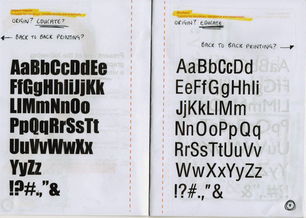
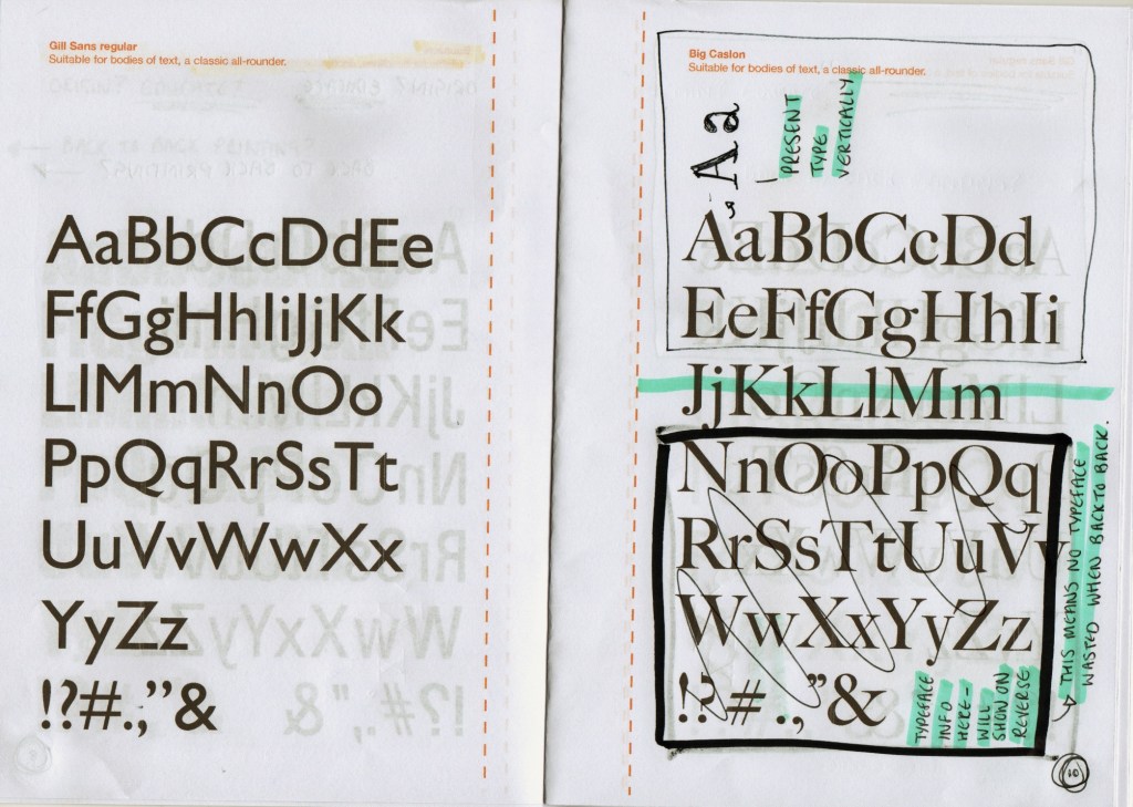
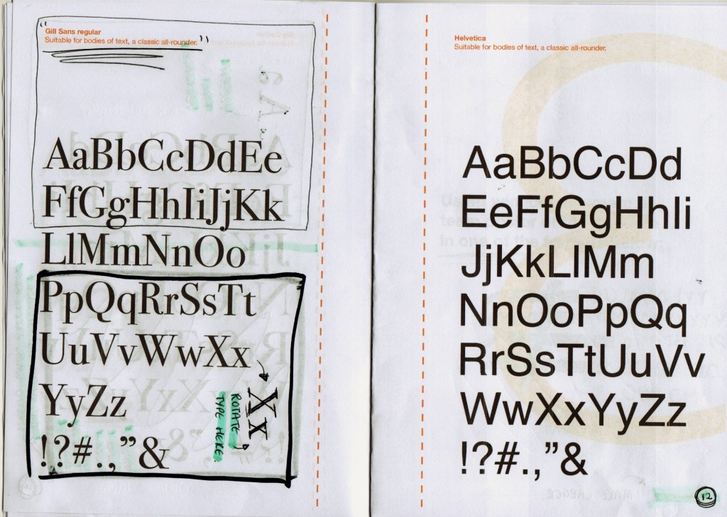
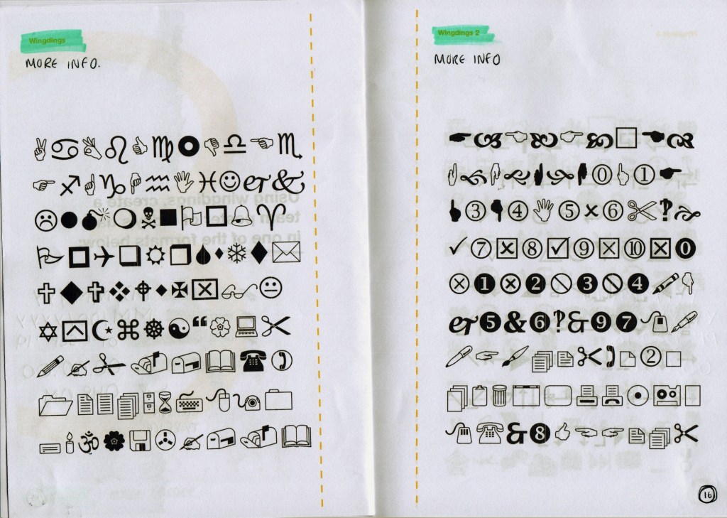
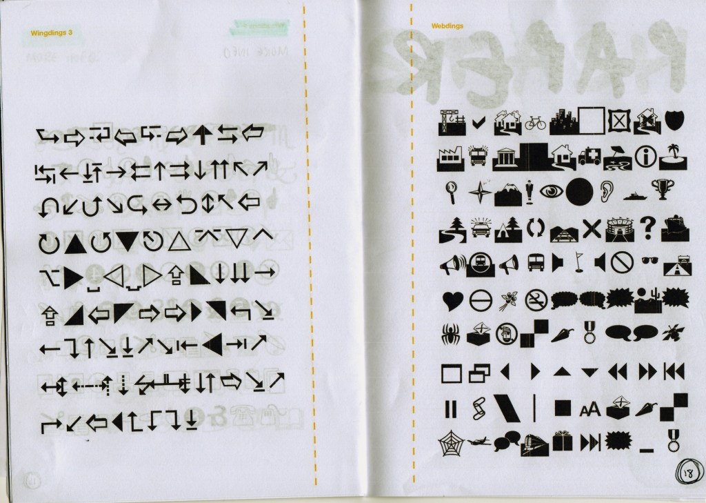
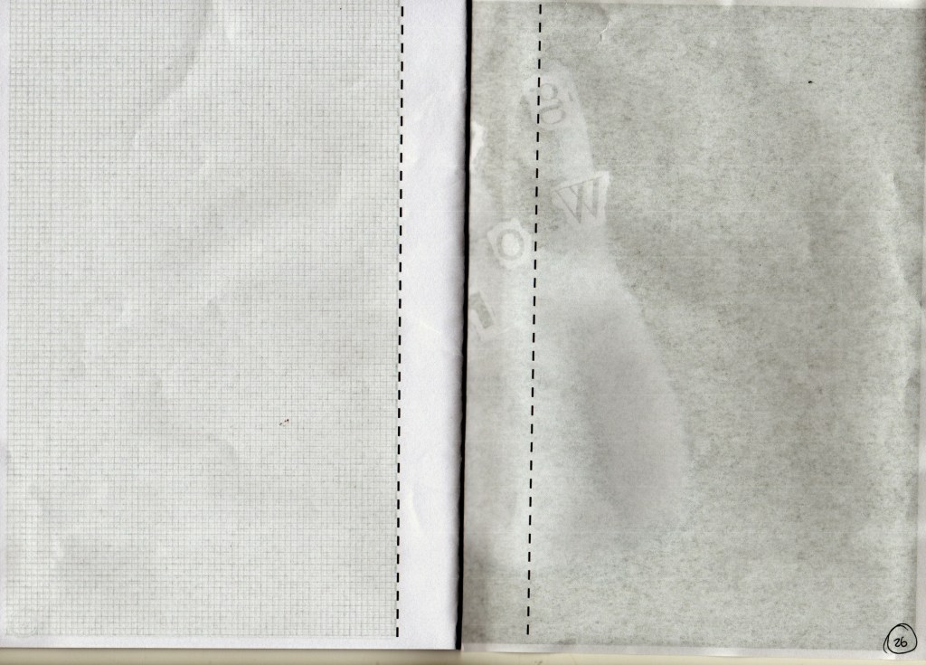
• The scans actually resemble Risograph printing which is not intentional; but I love the effect. Now I am wondering whether Risograph would be considered in my final printing method; it’s the element of layering which I think looks most effective here. The colours shining through the slightly transparent paper really enhances the layering effect. I want to research Risograph printing as this could be more sustainable as opposed to using a regular printer and ink
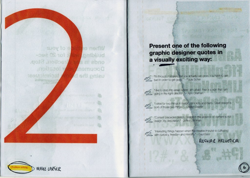
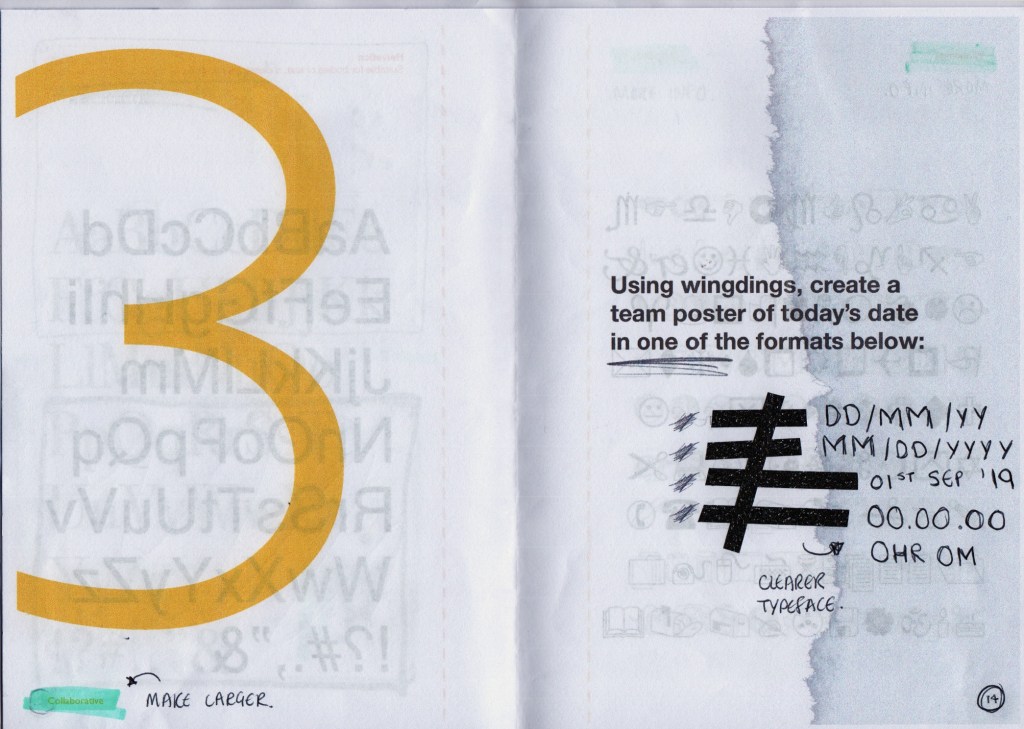
• Little details such as the addition of circled numbering on the pages gives that raw element and I want to apply this to the brochure pages
Considerations for improvement:
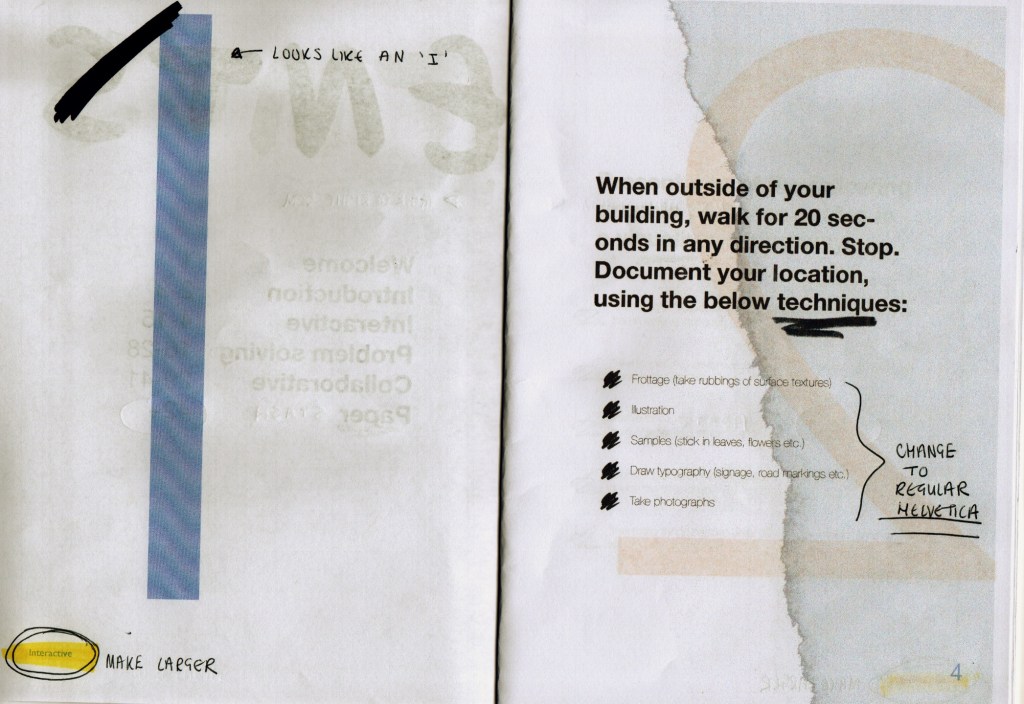
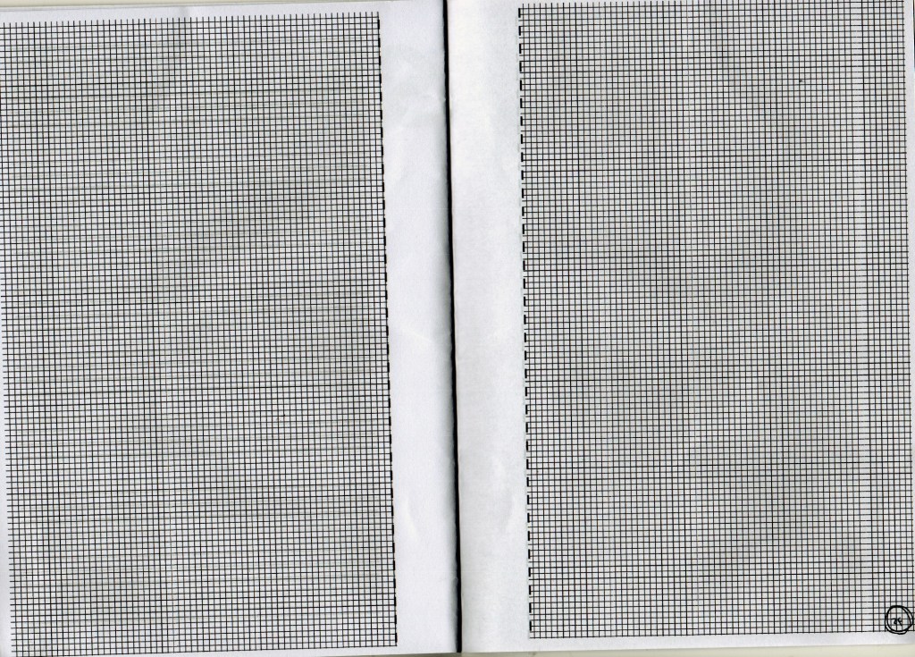
• Identifying that the tear out pages print back to back – I will action the amendments I have drawn above; the layout needs to change so that it doesn’t interfere with the next/previous pages
• Add descriptions for the typefaces and include origin in order to educate and inform designers of that typeface
• Input my scanned images into Photoshop and edit onto my brochure i.e. the numbered pages on the right should add little touches to the design
