
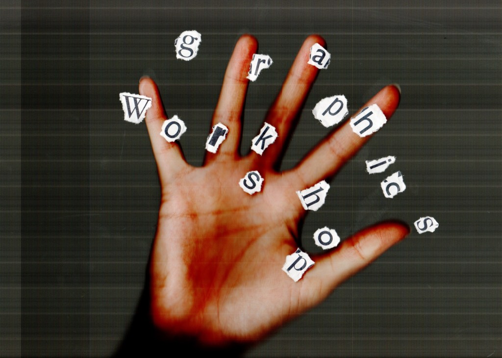
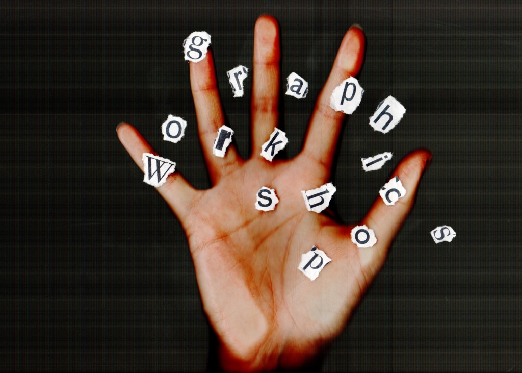
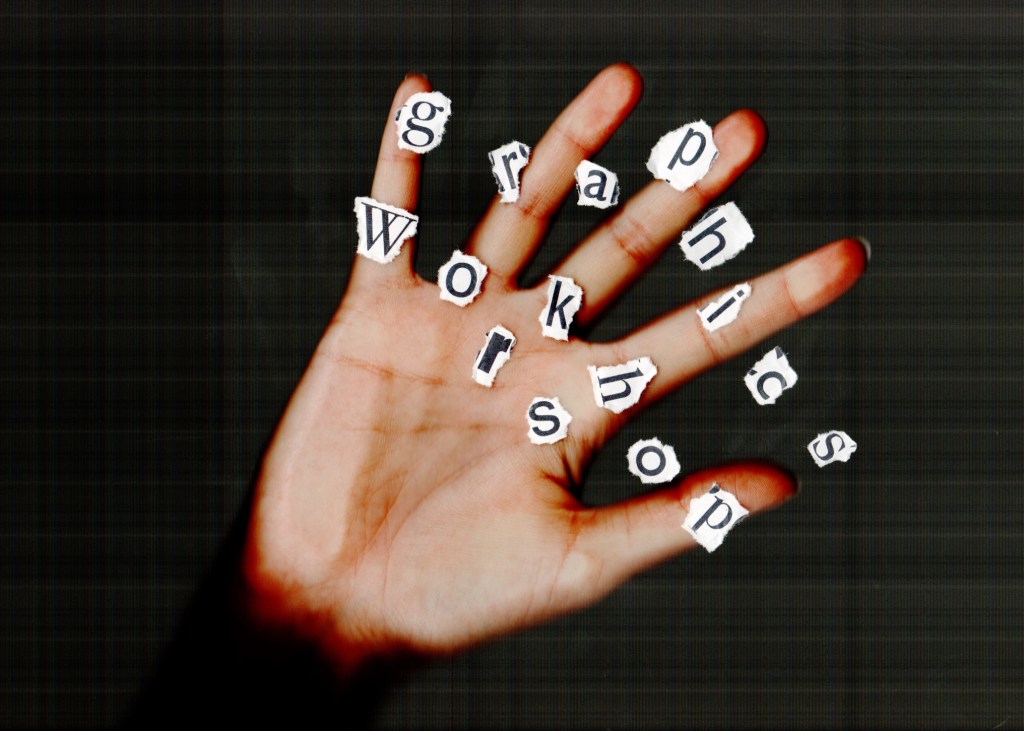
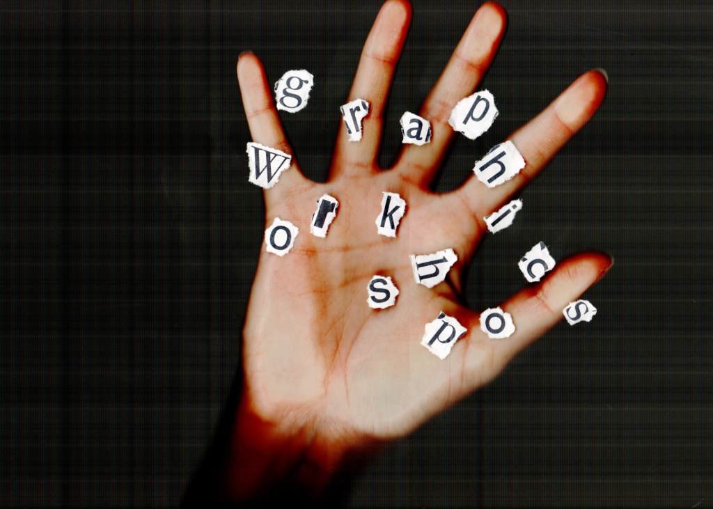
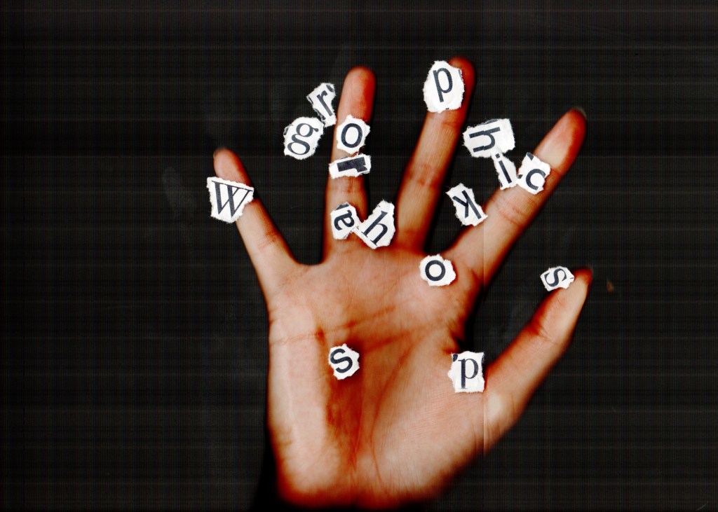
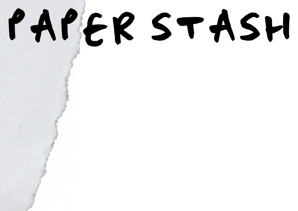
Brochure version #4
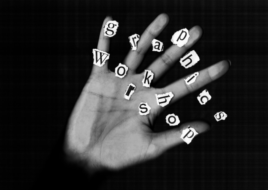
As per my feedback I revisited the scan with the ripped out lettering and printed out letters that are in the brochure itself, which I ripped out by hand and then placed on the scanner with my hand overlaid on the top. The creative message is strong in this cover as the hand is essentially a tool in this workshop; designers will be encouraged in all activities to leave their computer mouses behind and use their hands to hold stationery, paper and this brochure:


Creating my own typeface using Calligraphr
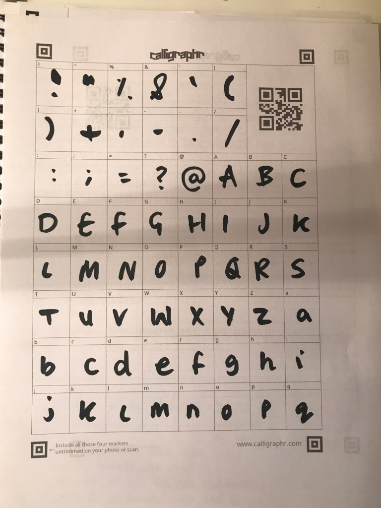
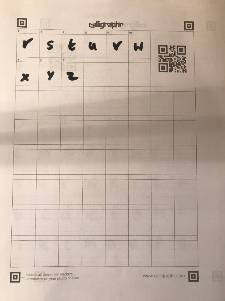
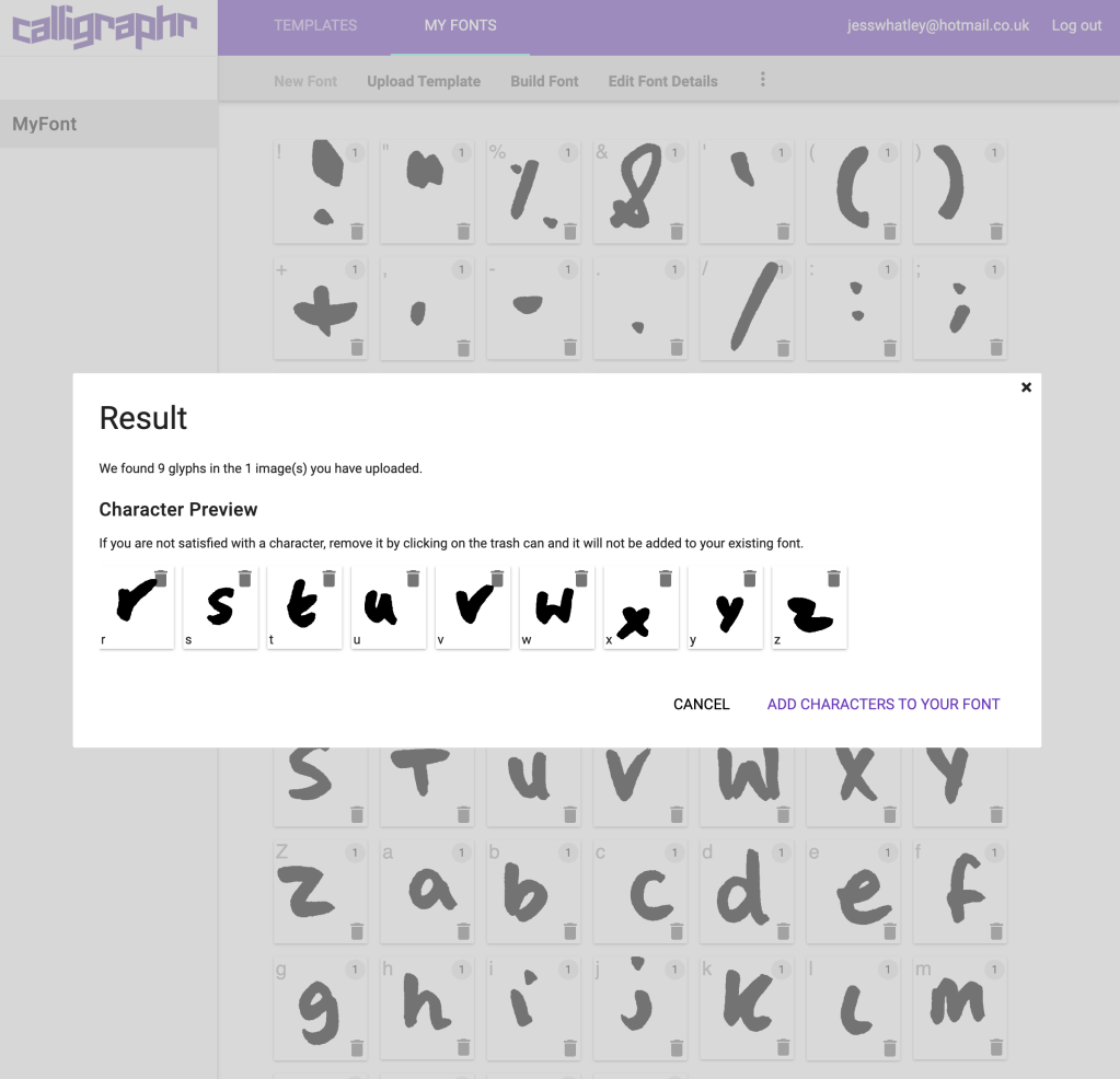

After having experimented with quick, free hand marker lettering above, I liked the idea of creating a marker pen typeface. I found Calligraphr which made this really easy for me to produce my own .OTF typeface and install. Seeing the letters all together in a paragraph is portraying a really playful naturally hand drawn element and I think applying this to my brochure will give it a much more relaxed, journal ‘feel’ to the overall identity.
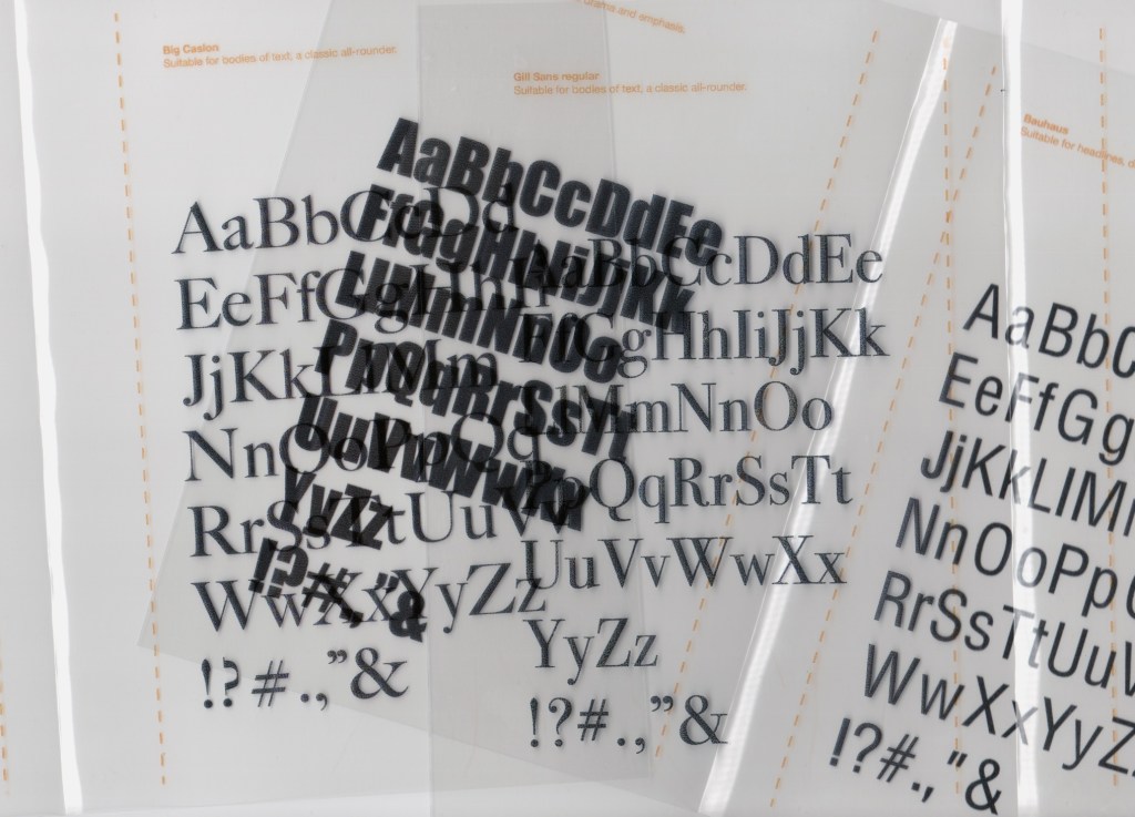
Printing on acetate for layering purposes
Brochure version #4


In order to bring this brochure together, I need to print it out as a mock-up and I want to write on it with any amendments as I usually would in the design process; however this time I want to see if this will actually enhance my final outcome in some way. I think it’s important to consider how the design process does develop and one of the most valuable things to do is print it out and see how mock ups look visually as things look different on screen and printed. Printing out my brochure will ensure it looks suitable for the workshop classroom environment, and also whether scale is correct.
