
Further development
Bringing back the ‘craft’ element into my brochure design; so more experiments required. My concept so far has used mostly digital elements; shapes, borders, typography. I want to include my own.
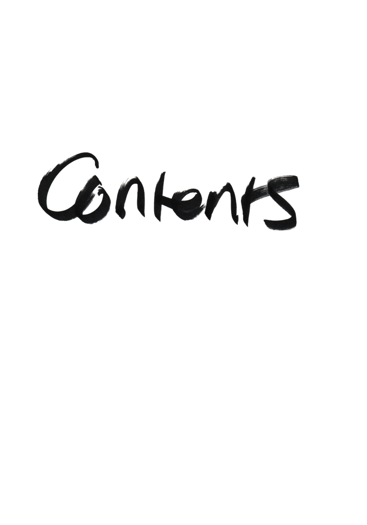
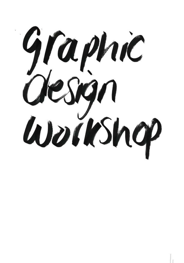
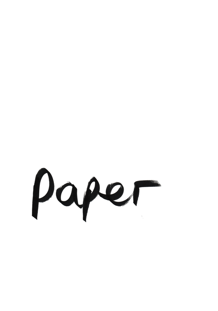
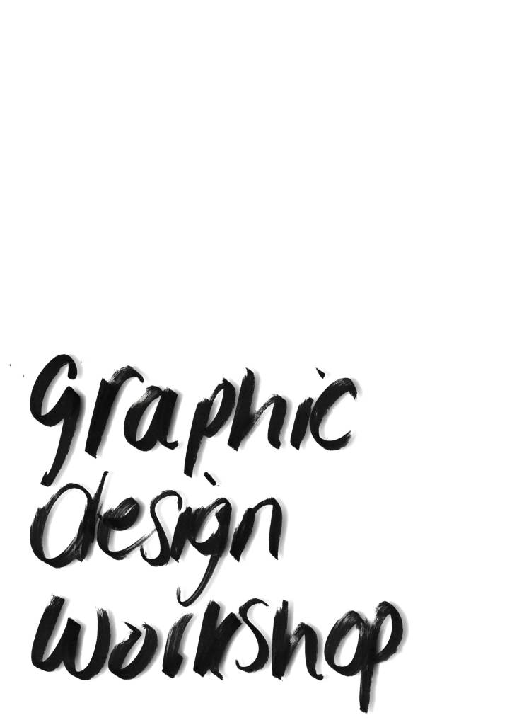
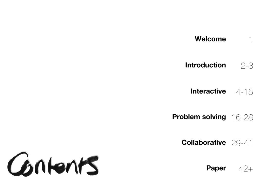
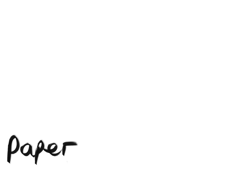
I know I need to create a cover for my brochure, and consider a contents header page, and a paper section page, therefore I’ve tried to capture playful type using various pens and markers with different pressures and speeds to get visually effective type forms:
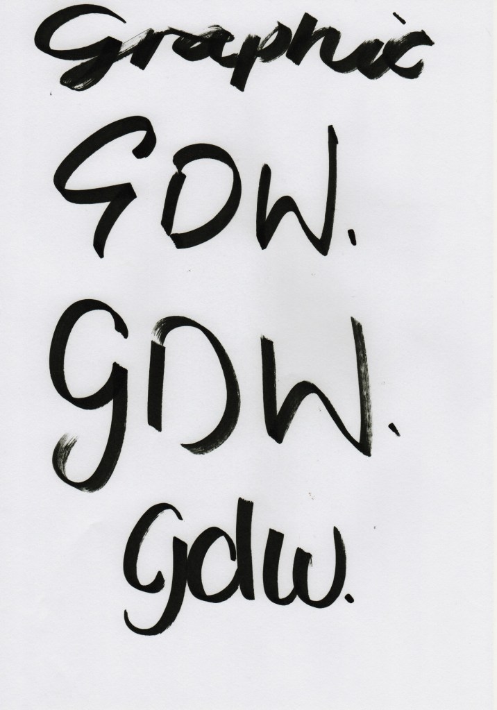
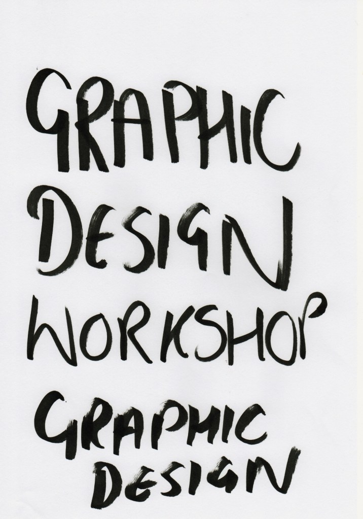
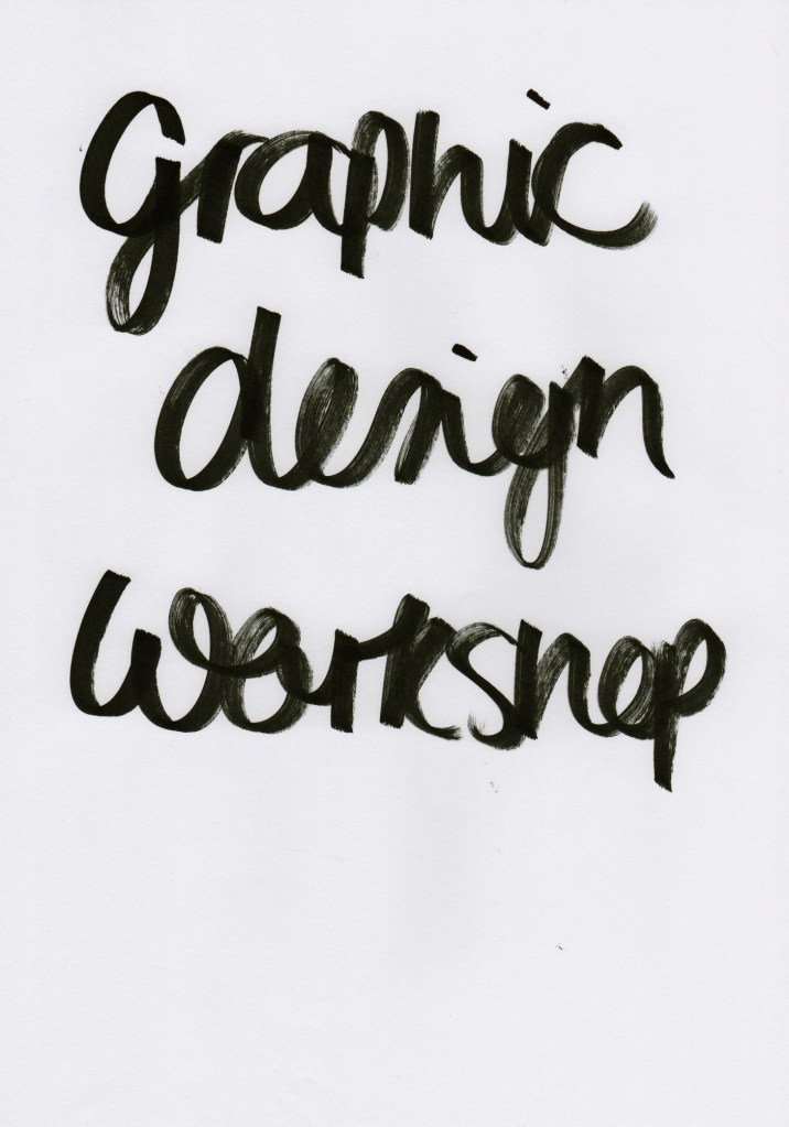

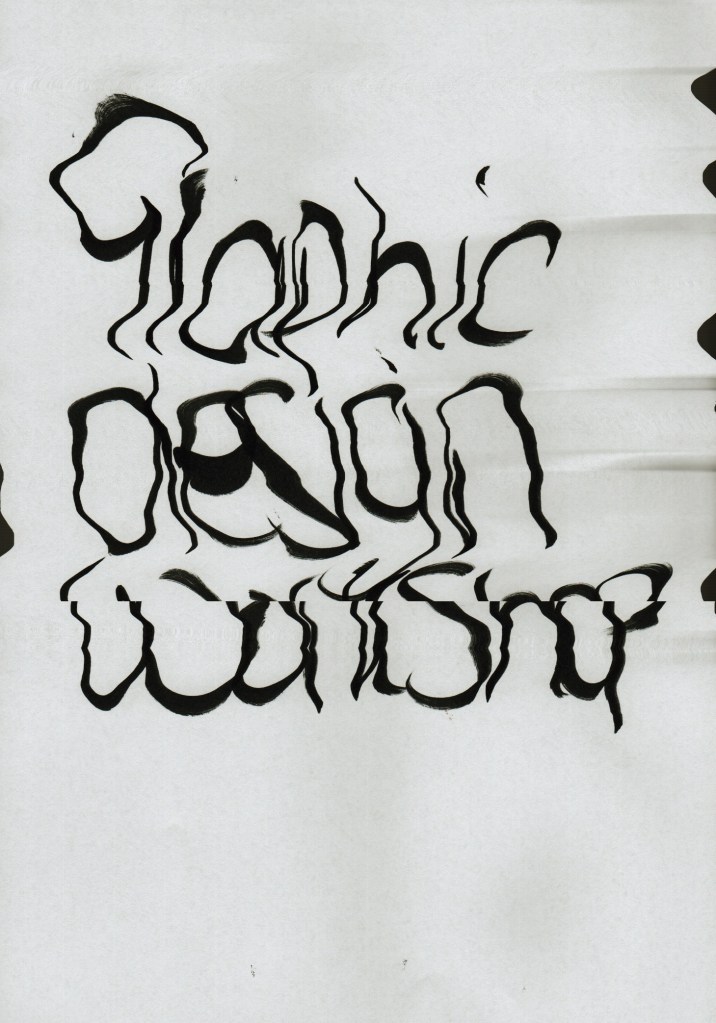
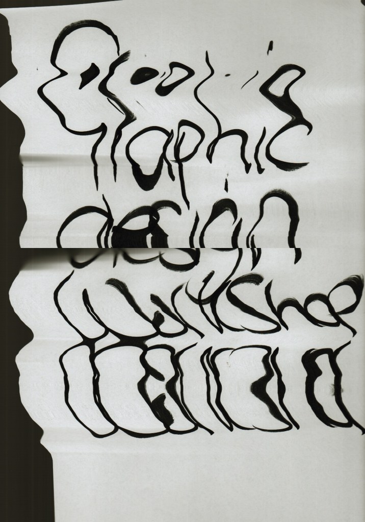
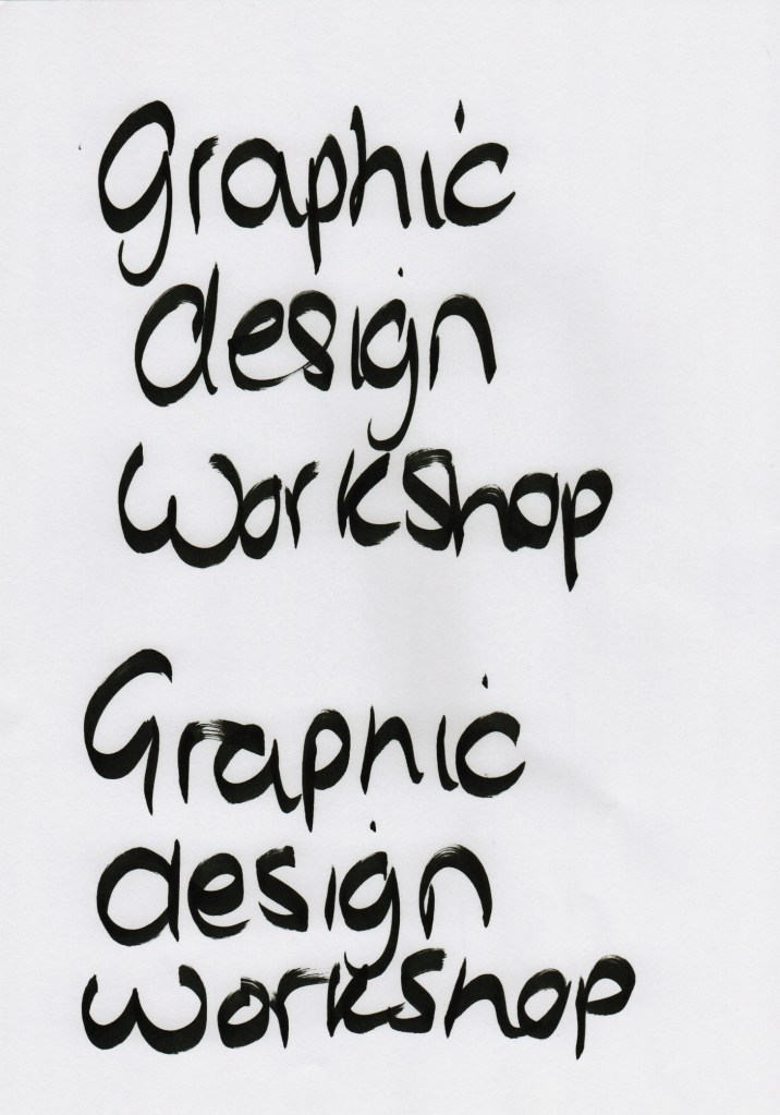
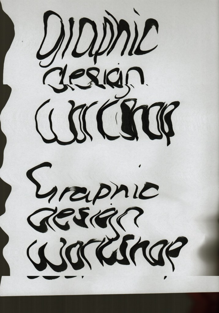
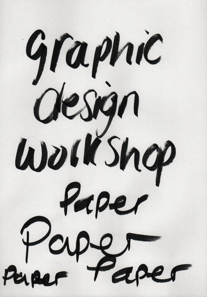
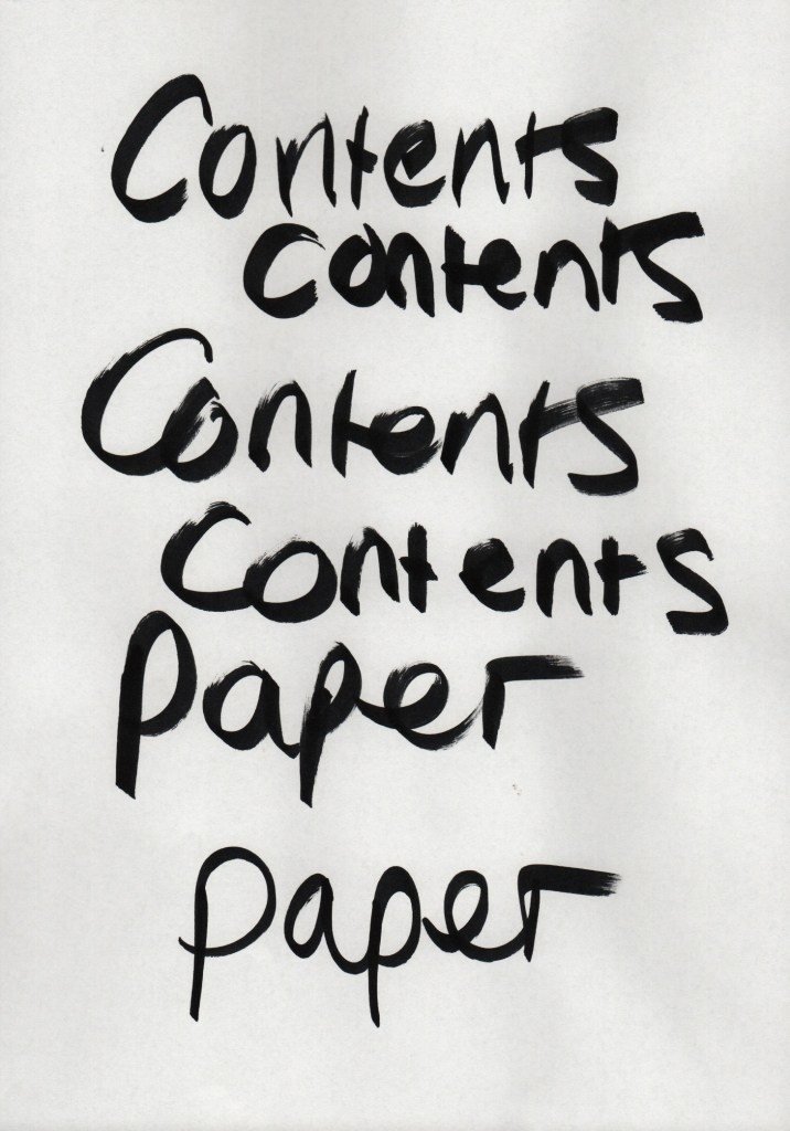
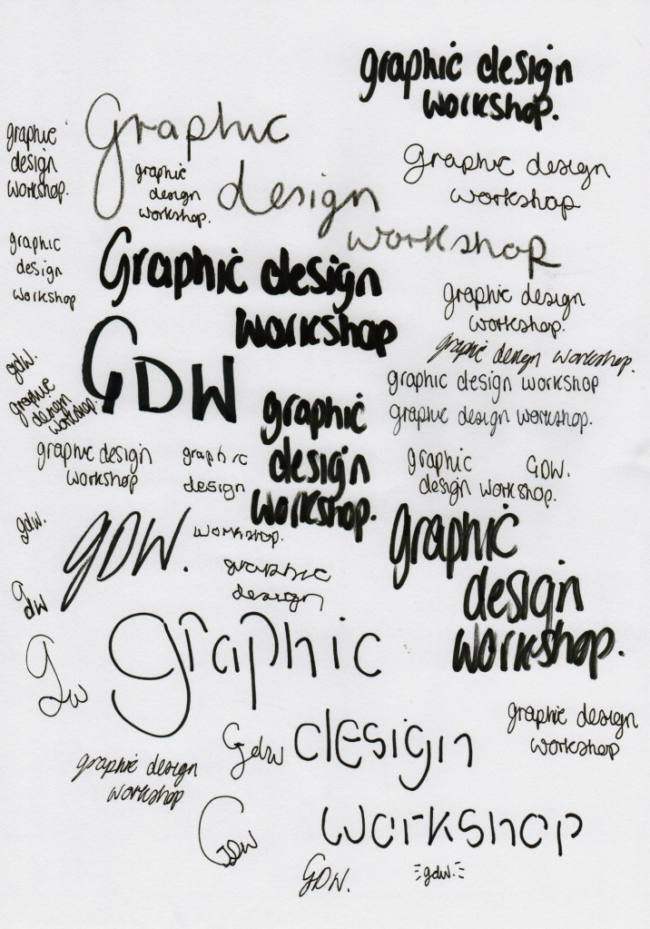
I picked the three I thought fit my brochure meaning the best. The varying pressure in the strokes of letters was visually interesting, presenting texture in my lettering through angles and speed of how the letter is created, also depending on what letter sits before it determines whether the next letter is more fluid or bulky. This is down to my own personal style of writing in pre-cursive. In order to transfer this to my brochure I input the following images into Photoshop, and saved as PNG to be a transparent overlay where I can layer other things:
Brochure development version #3


Feedback version #3
Things to improve:
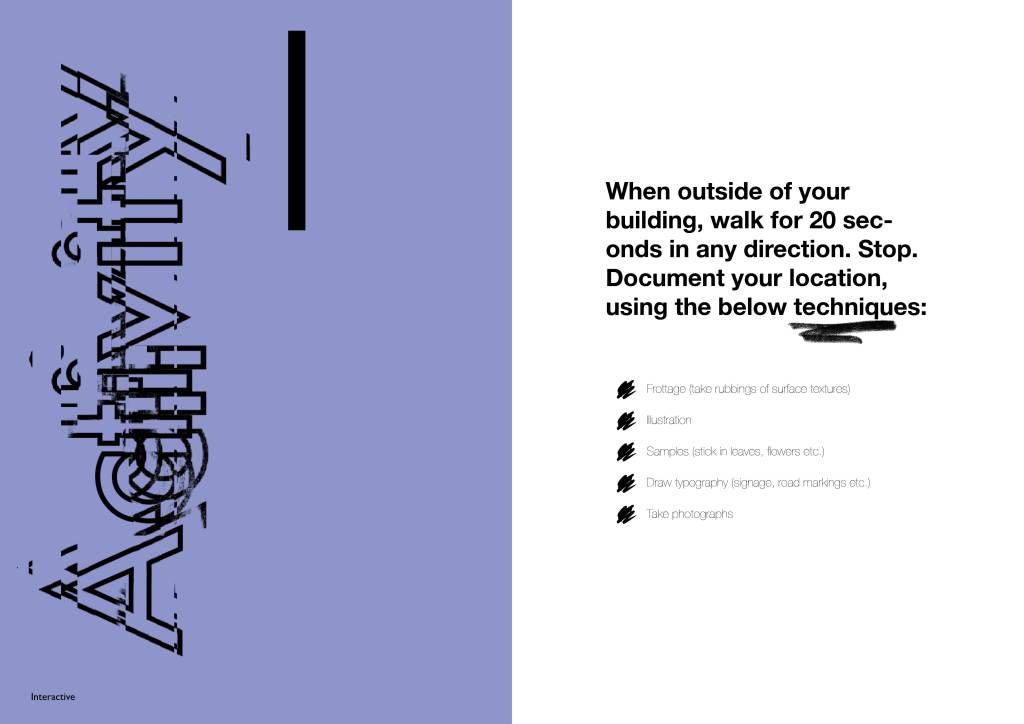
• The activity page – do I need the word or is the number enough?
• Colour scheme; how can I make it more subtle – maybe the numbering on activity pages is coloured instead of background? I really like the colourful touches with the tear off dotted lines, and the text throughout each category
• Experiment with ripped paper visually to bring in that craft element
• Further develop cover page typography and layout to represent my workshop – consider week 8’s scans in with ripped up assorted lettering and my hand as it will tie in with the introduction of ripped paper and convey the ‘hands on creative’ message
I also had a tutorial at this point where I had additional feedback from James:
• Cover page looks effective with original week 8 scan with word ‘activity’ – I need to present ripped lettering of ‘graphics workshop’ instead
• Are the text pages back to back? If so will cutting out one side eliminate the use of the other side? Yes, this is something I hadn’t thought of!! I need to reconsider the format for these pages
• Consider outside the page and how I can make the pages look ripped or distressed from crafting themselves
• Print out the booklet so I have visual reference on the design so far; draw on it using different mediums such as marker, biro, highlighter and tape to overlay and make amendments. This will make outcome more random as in ‘hand crafted’ and ‘journal’ inspired, more squiggles, more doodles. Scan in
• Print on acetate and try this to see if looks effective as layering
• Hand draw my own typeface and incorporate as opposed to just writing the words I need
