
Reference material
Anthony Burrill
Designer / Image Maker / Communicator
Listening to Anthony discuss/show how different working used to be when starting out with typography with photocopiers is a great insight to how the world worked without easily accessible technology. I really liked how he said that when you work by hand your eyes will see things that they won’t on a screen. Trying to make everything line up on a screen is very true – when we have things out on a table or workspace we can arrange them much for freely and see them from different perspectives other than straight on. I think digital has its benefits when you’re working with mass production or finalising work for completion, but not so much in the early stages. This is why I think I find research so important in my work, because that’s a time to get hands-on with work before transforming it into a finalised artefact in some way.
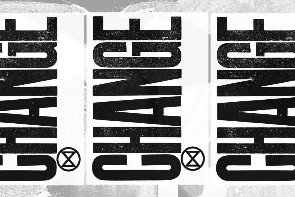
I can see from his work as it’s developed that although it has always originated around letterpress, it’s grown to a much larger scale and other materials have been involved – wood, metal, inks, machinery. This is probably down to his work becoming manufactured and requiring many more copies. The Ditchling Steam Print is really beautiful and utilised the use of texture in large scale type very well. I really love the below print because of how it was generated too – there is a lovely reference to industry and manual labour using the steam roller, that works really well with the style of image/text that is produced.


Another project I really liked is the Extinction Rebellion because of the power created within the message.
The way that Burrill presents all of his type instils power – there’s striking messages throughout all of his projects. However when the output is intended to be political and raising awareness/fighting for justice, the message becomes really powerful. The harsh, striking textured black and white text becomes very clear and straight to the point in a protest or campaign and this makes it successful – people notice it and talk about it.
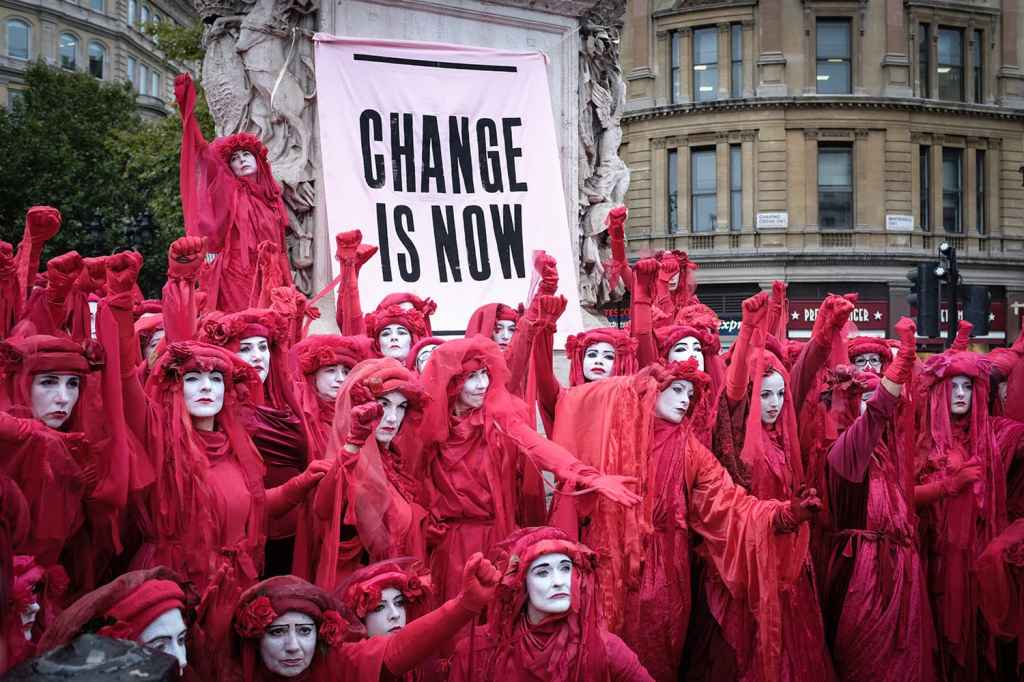
In terms of his role being an author/maker, from looking at his projects and the outputs I would say he is a combined political activist/artist and I would categorise him in the same area as Banksy and Shepard Fairey, for instance. His work isn’t offensive (as he said in the lecture video, there’s a fine line between gaining interest and losing it), but it’s enough to provoke thought and get people talking. Burrill’s work is certainly bold as you have to be willing to associate yourself as an artist with political movements and therefore I do think he has seen a gap in the market for this type of work, and put himself out there.
George Hardie
Graphic designer / Illustrator / Educator
Very much like Burrill above, I really admire the hands-on crafted projects that Hardie creates.
“An awful lot of things like the insects or things found on archeological sites are recorded as drawings rather than photographs. There are huge limitations to how much you can understand about a 3D object from a flat picture. They’re rather stilted illustrations because they show exactly how many feathers a bird has or how many petals on a flower, but it’s thought by a lot of scientists that drawing is the best way to record and classify something. I can go online to find out roughly what something looks like, but I would rather use someone else’s drawing as my starting point. A lot of my references are other drawings of things. I have a huge collection of catalogues of objects or Victorian patterns, children’s books of seashells, stencilled letters and encyclopaedias.”
George Hardie It’s Nice That
I can relate to this as I absolutely love the old scientific illustrations of wildlife/fauna/sea creatures by Ernst Haeckel for instance. I think there is just so much detail in those drawings and it’s really useful for noticing where shadows/highlights are, when you sometimes get them overexposed/underexposed in photography.
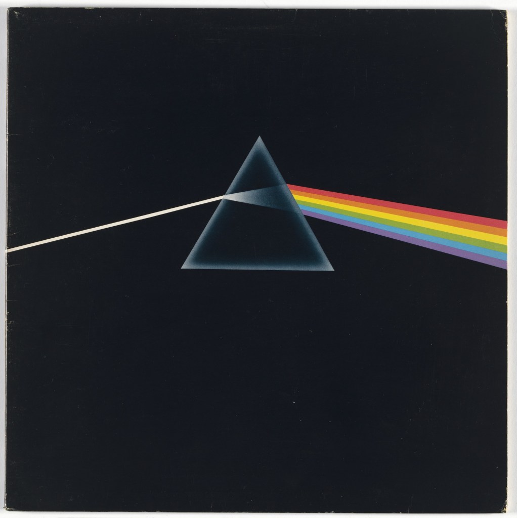
Pink Floyd Dark Side of the Moon 1973 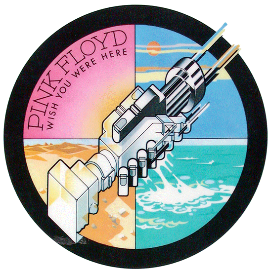
Pink Floyd Wish You Were Here 1975
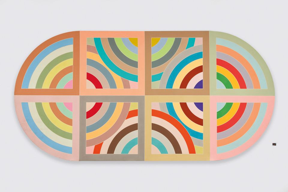
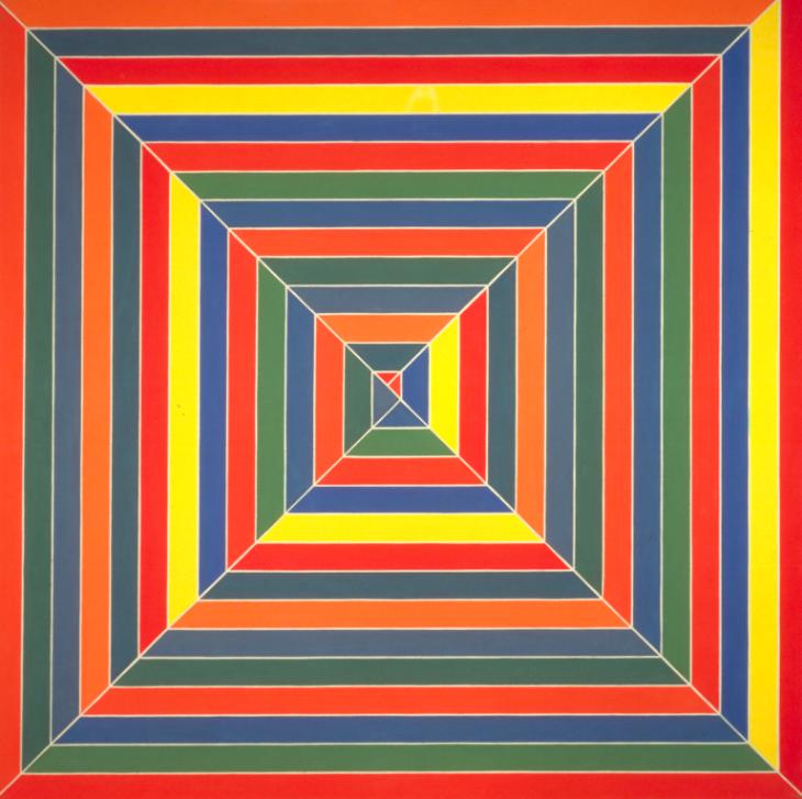
The above record artwork is geometrical and symmetrical; it’s clear that Hardie has an eye for alignment and proportion. I think particularly during his time, his work was on trend due to the pattern and decorations / geometric abstraction movements of the late 60’s and early 70’s. Although his work takes inspiration from these movements, he has also considered space events (i.e. Neil Armstrong being the first man on the moon in 1969) which has influenced the title of the bands album itself.
I have started looking at other movements that may have inspired Hardie; the Hard-Edge Painting movement certainly looks familiar in the Dark Side of the Moon record design with colours, clean lines and contrasting hues:
Hiraqla Variation II (1968) Private Collection, NY © 2017 
Hyena Stomp 1962 http://www.tate.org.uk/art/work/T00730
Daniel Eatock
“My specialism is lateral thinking, resolving the complexity encountered in the world with reductive poetic logic. I intertwine commercial and cultural practice: responding to the paradox of daily life and the complexities of project assignments. I seek focused solutions that feel inevitable. I get there by starting at the beginning, asking why, what if… then making sense of the things I find with radical acceptance and by embracing truth.”
Eatock’s ‘About’ page on his website
I have chosen just to look at the above specifically because it’s such a strange way of wording that’s he has random ideas in the form of a website and likes to use paint and make splodges:
Eaton is a really odd example of authorship. I couldn’t categorise his work and overall I would just say he experiments with ink and ideas. For me, his website reminds me of a file explorer folder with random things saved in it for inspiration – it doesn’t really have much process involved. Does this make him an author? Sort of… I mean he does have ideas and he does make things. Just in a very basic way… Maybe there is a gap in the market for people who don’t just categorise themselves as one thing and instead, do several things just because they want to?
