
final Quadriptych outcome:
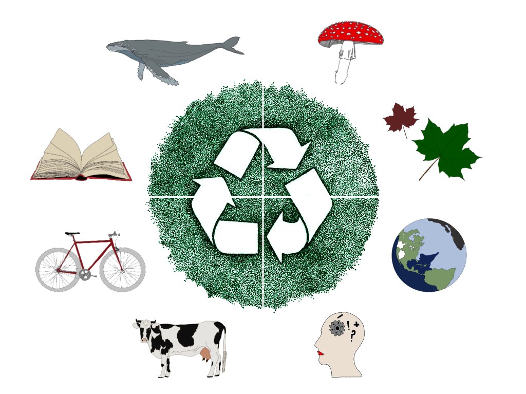
My final four images have been split into four images: my background (top left), what inspires me (top right), where I live (bottom left) and what role I want to play as a designer (bottom right).
I have tied them all together with a central dotwork image as dotwork is something I have been doing for over a year in my free time, and although it’s not my main field of practise I do really enjoy it and I strongly believe that success will come from doing what you enjoy. I have decided to draw arrows representing a cycle, as I feel each section is continually evolving as I grow as a designer. Being green, it also reflects on sustainability and the way I approach my work.
How could I improve the final outcome?
In terms of my own work, to be critical: there is a lot of white space. I think I would like to adjust this and seeing as I really enjoy mixed media processes, I would like to develop this further with photography elements ie. macro photography. Having textures could work really nicely with smooth, digital illustrations.
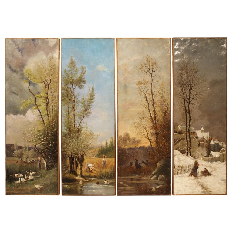
Above image: This is a French 19th century antique painting by a school of artists, and depicts the four seasons in a year. I could try a more traditional approach, for example in my research I really liked this seasons approach to a Quadriptych. The orientation of the overall image could be experimented with, maybe even trying angular compositions.
