Intro Design research:
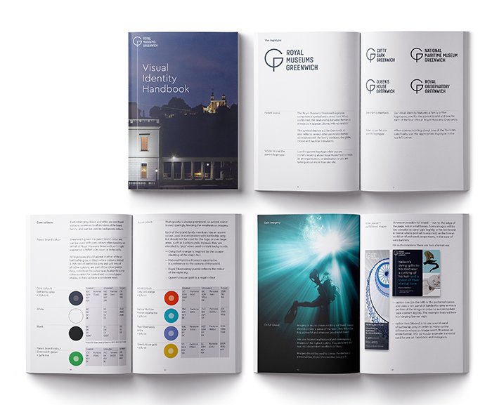
“Our new brand strategy and visual identity will help build recognition, profile and loyalty, attracting more visitors and a more diverse audience. We are a world-class global attraction – and this rebrand embodies our ambitions.”
– Eleanor Harris, Director of Visitor Experience and Enterprise, Royal Museums Greenwich.
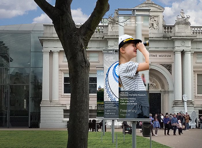
I love museums and find this piece visually fitting with typical museum branding (above) – the large images with a logo and museum name. I noticed that the text is large on “free entry” – this is something that is often written in the fine print and many museums ask for donations. I really like how Intro have done this, as it makes the museum seem more welcoming and the information is clear.
I appreciate that the typography process is shown below when creating the letter C, there has been lots of experimentation in the production of this logo and it’s really interesting to see!
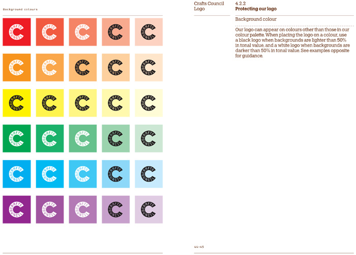
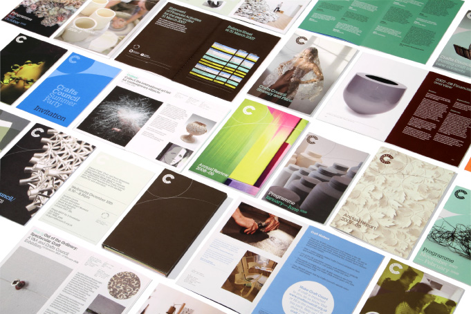
“Intro conducted a thorough review of the Crafts Council identity and printed communications, before setting to work on updated versions of both. Having created a new set of identity guidelines, we then redesigned all printed materials to sit within the new style.”

Sarah Boris research:
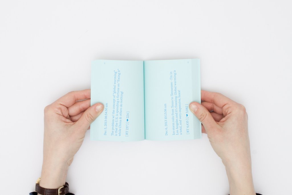
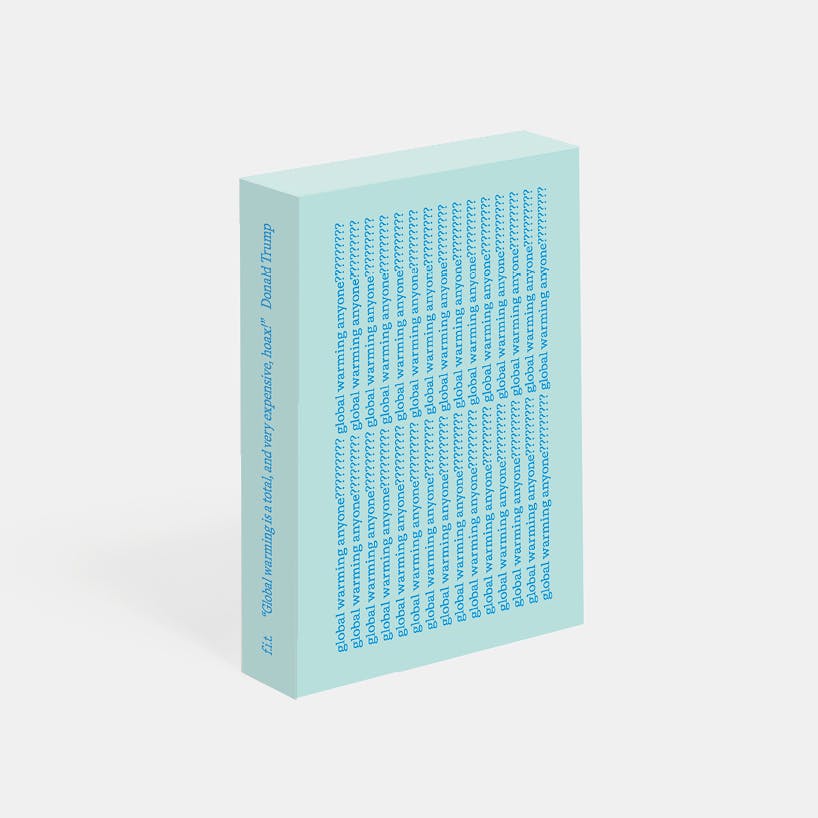
“Global Warming Anyone?”
A small book compiling 118 tweets by the current US president on climate change. I love how seemingly oblivious people of power are to global warming, particularly POTUS – that’s evidenced in this book.
“I always try to make time to meet new people and do something different. I used to spend a lot of time in meetings sometimes nearly up to two days a week when working full time. Now meetings are more occasional and I feel this has freed up time to make more things and design more. I like to be hands on. I find a lot of ideas also when I walk so I have reinstated daily walks in my routine. You’re neither on the phone or the computer, it’s the perfect time to disconnect and let your mind drift.” – Sarah
I love this quote from G-irl as I feel the same, if I need to clear my mind or refresh then I will venture outdoors. It’s so important to look after yourself and it’s easy to forget that when you have busy schedules and lots going on. It’s really interesting and valuable to get her perspective on schedules, especially meetings. It’s about prioritising your time and allowing yourself to be creative in your own way.
Regular Practice research:
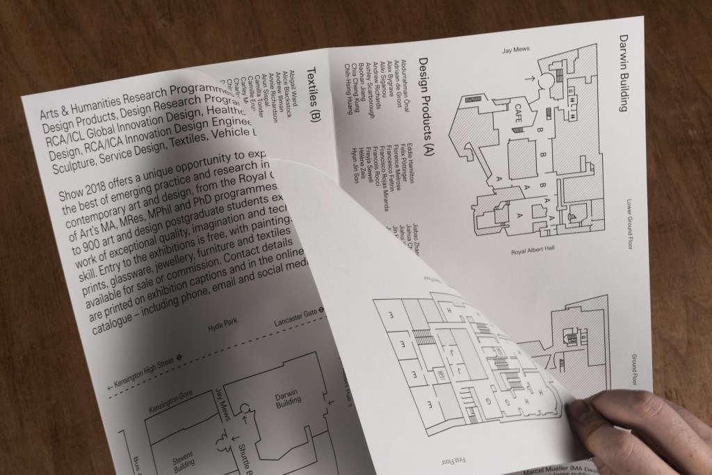
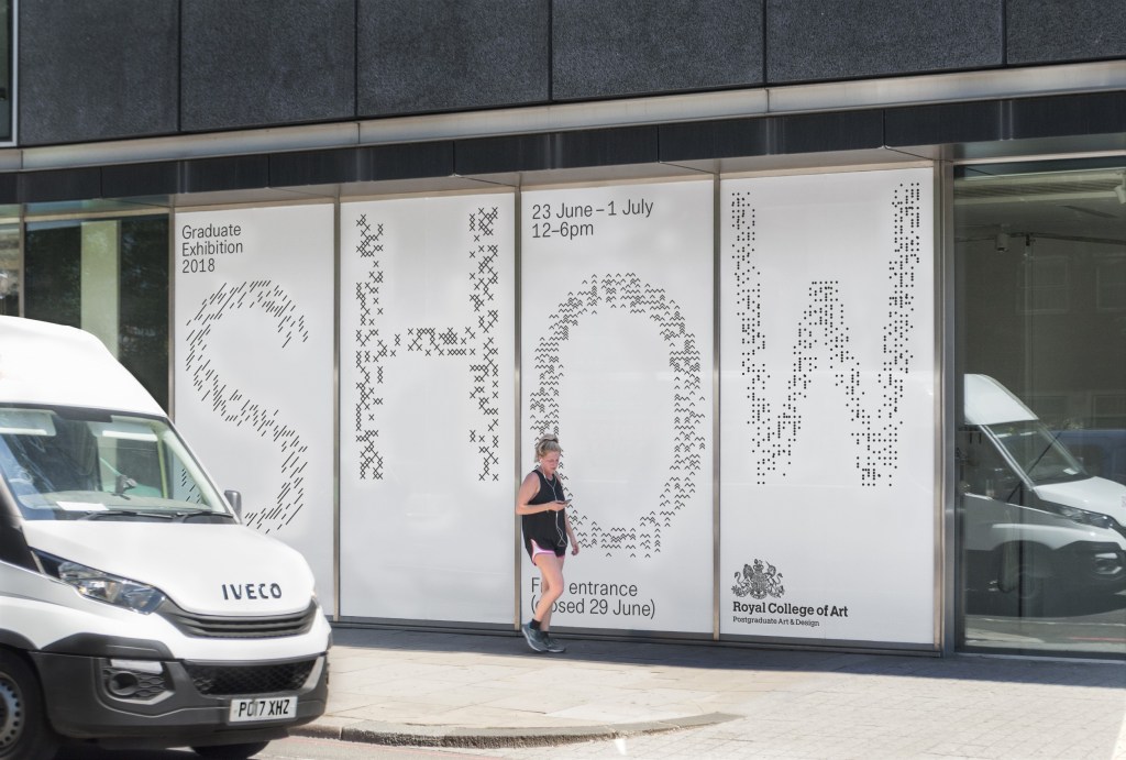
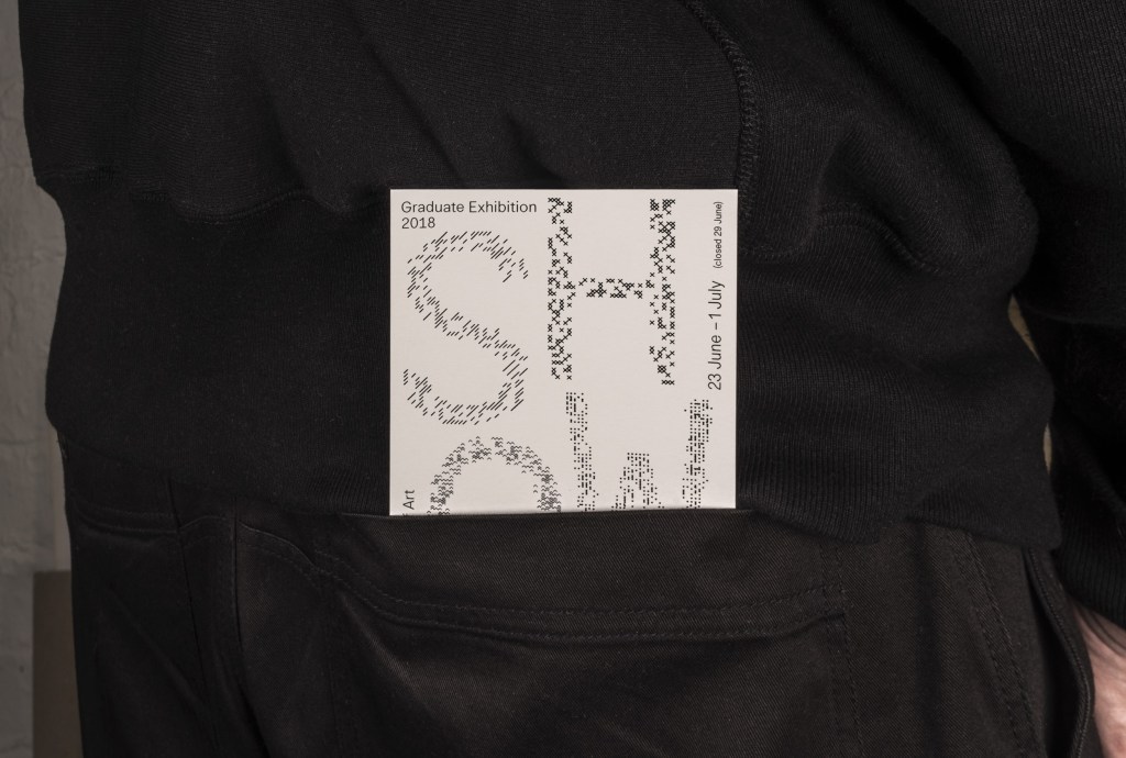
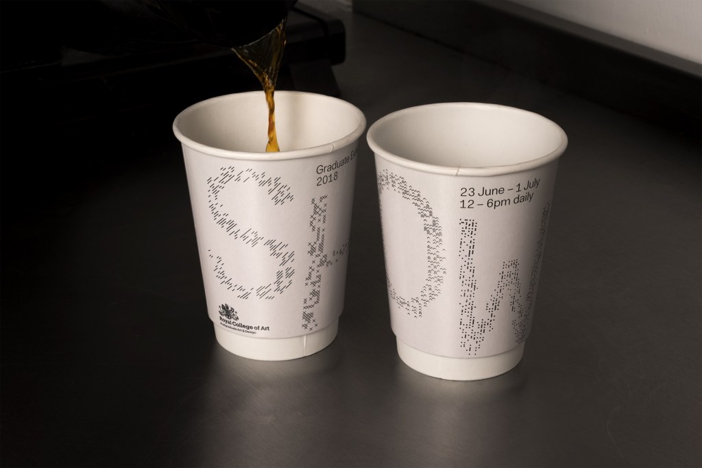
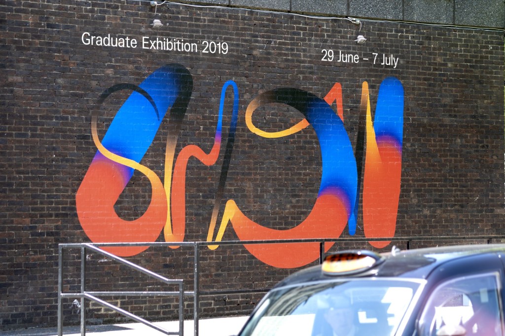
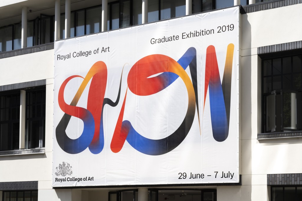
Identity for the Royal College of Art Graduate Exhibition 2018. The identity revolves around a built tool that allows us to populate small elements into given letterforms. Deliverables for the project ranged from large scale vinyl applications on buildings, to printed maps & way-finding.
I find Regular Practice really inspiring as their typography is visually entrancing, particularly the RCOA’s project (pictured). I love that the final design was placed on numerous printed items – paper cups, billboards and leaflets. The black text looks so effective with the white space, and the arrangement lets the text breathe – it reminds me of poetry which seems fitting as it’s for a creative show. I would definitely use this as inspiration for text related branding.

Sam Winston research:
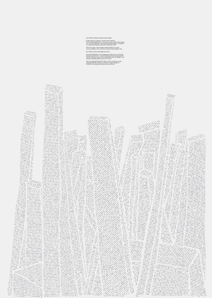
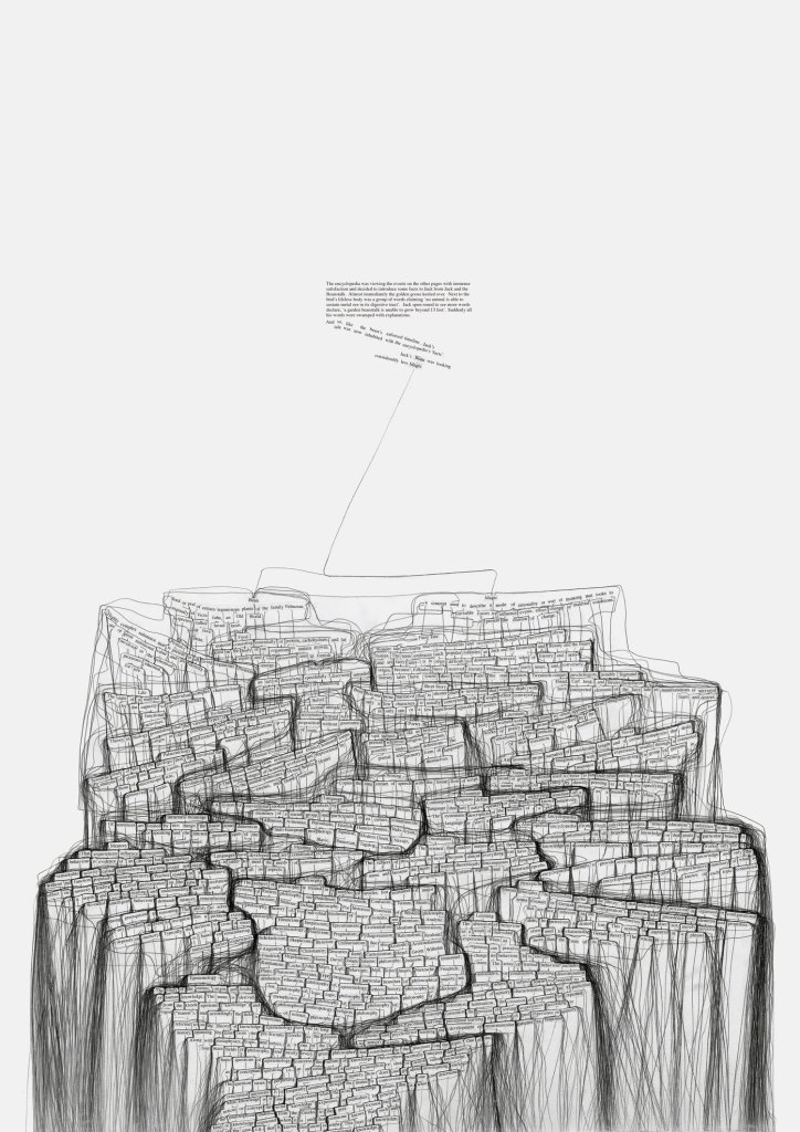
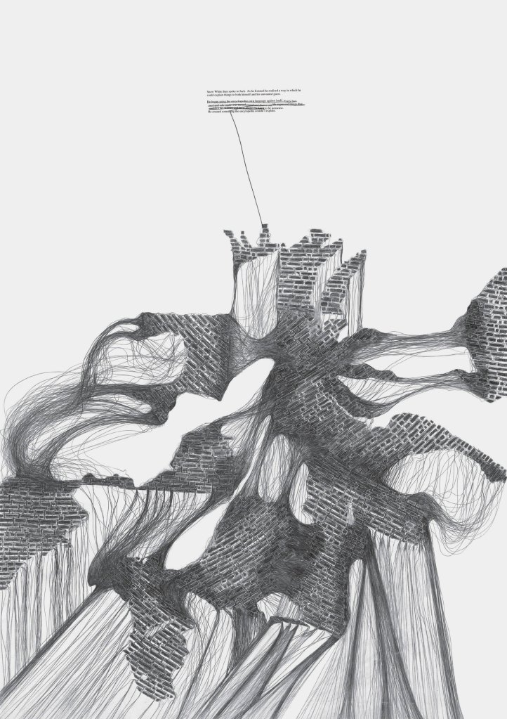
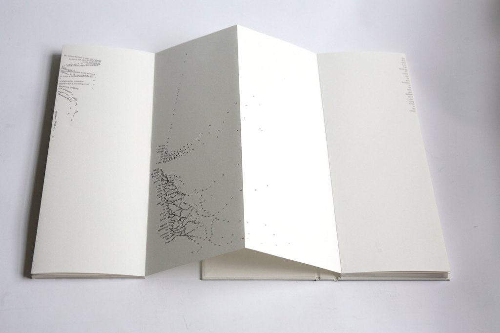
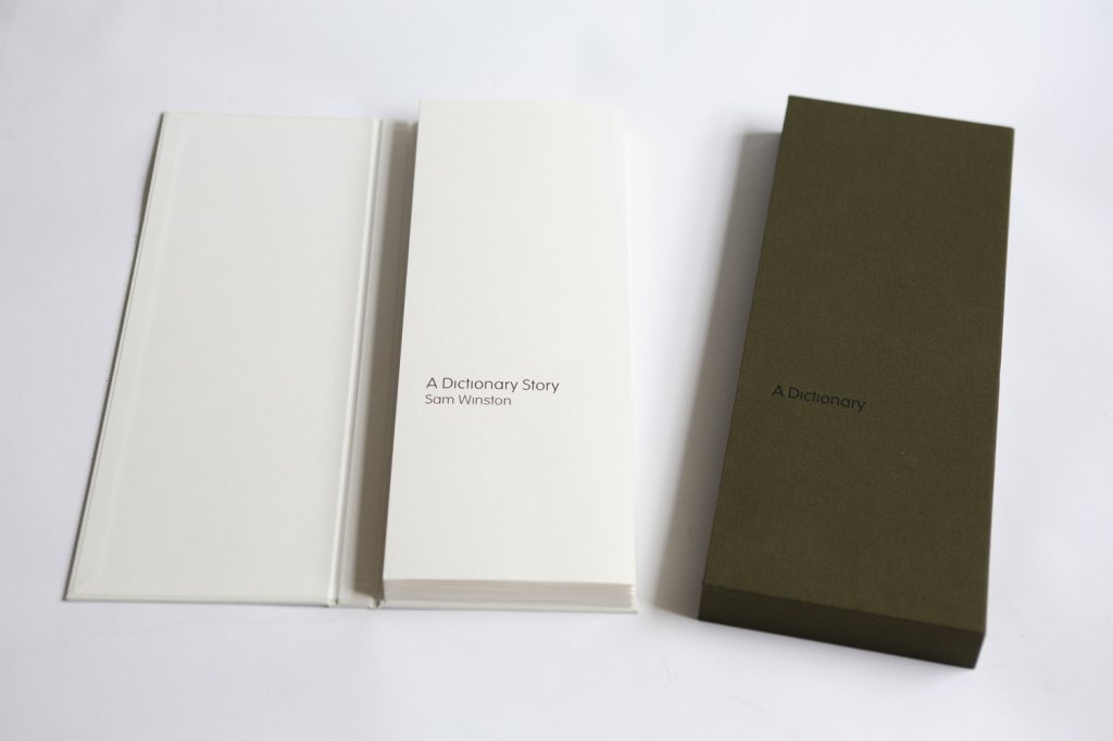
This exhibition Made Up True Story looks so calming and peaceful. The arrangement of the words makes the project aesthetically pleasing to look at – and each image is so detailed you would feel the need to inspect them up close. It’s interesting that the outcome is presented in this way as Sam talked about his studio being quiet and focused too in the interview.

“The way you navigate a timetable is very different to the way you read a short story” he comments. “I wanted to take these different types of visual navigation and introduce them to each other: a timetable re-ordering all the words from beauty and the beast, or a newspaper report on Snow White.” It’s a great insight to see how a designer has considered the audience, and the purpose of the outcome. There are many ways to present text and it’s important to ensure type and size is presented on the final artefact in a correct format.
SomeOne/Simon Manchipp research: