
My surrounding area’s identity
24 photos:
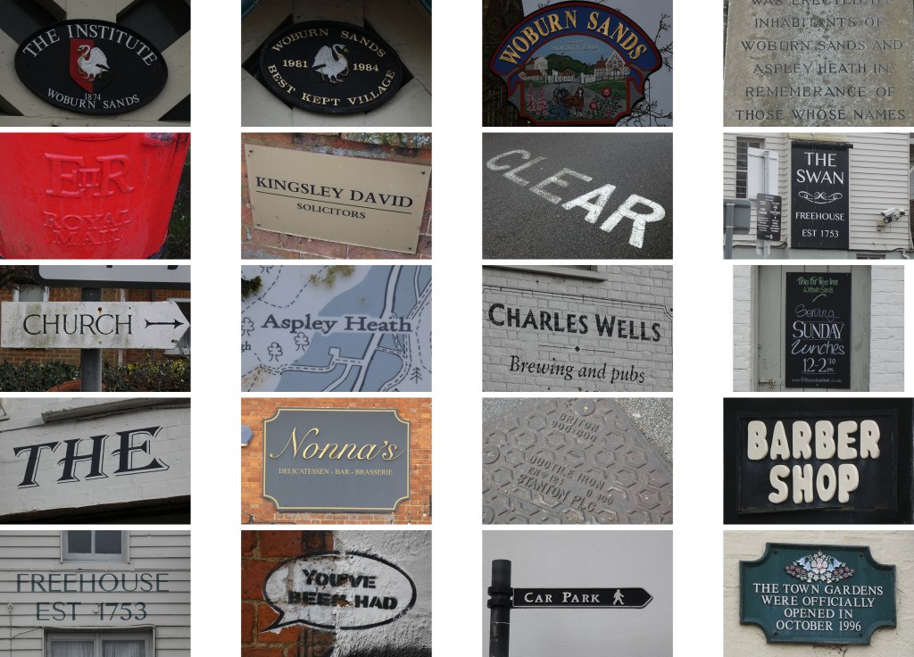
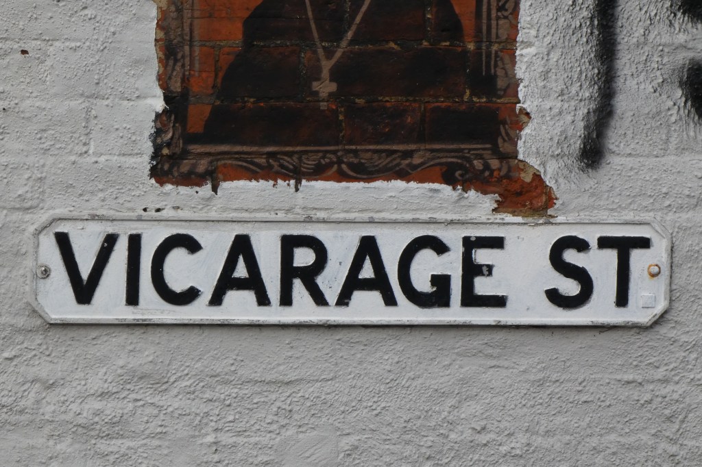
Chosen 5 examples of typography
Reflection of my chosen photos:
The five pieces of typography I have decided to choose as my final outcome all come together to capture the evolution of the wealthy town Woburn Sands is today, with connections to London and tourism. The striking similarity of this village in the 19th century to the 21st, is that there is still a demand for accommodation here, as people still reside here for travel to and from London. This is factored into the way businesses have chosen to advertise their hotels, restaurants and shops as their signs seem to all clash for attention. There is a heavy use of serif typefaces in metal and stone which have weathered with time, highlighting the Roman lettering influences which flourished in typography over the years. On first glance, image number 4 seems like the “odd one out” however, I felt it was fitting with town becoming modernised, as graffiti itself is a representation of modern day culture.
Exact location:
52.0122’N, 0.6473’W
6-47 High Street
Woburn Sands
Milton Keynes
MK17 8SO
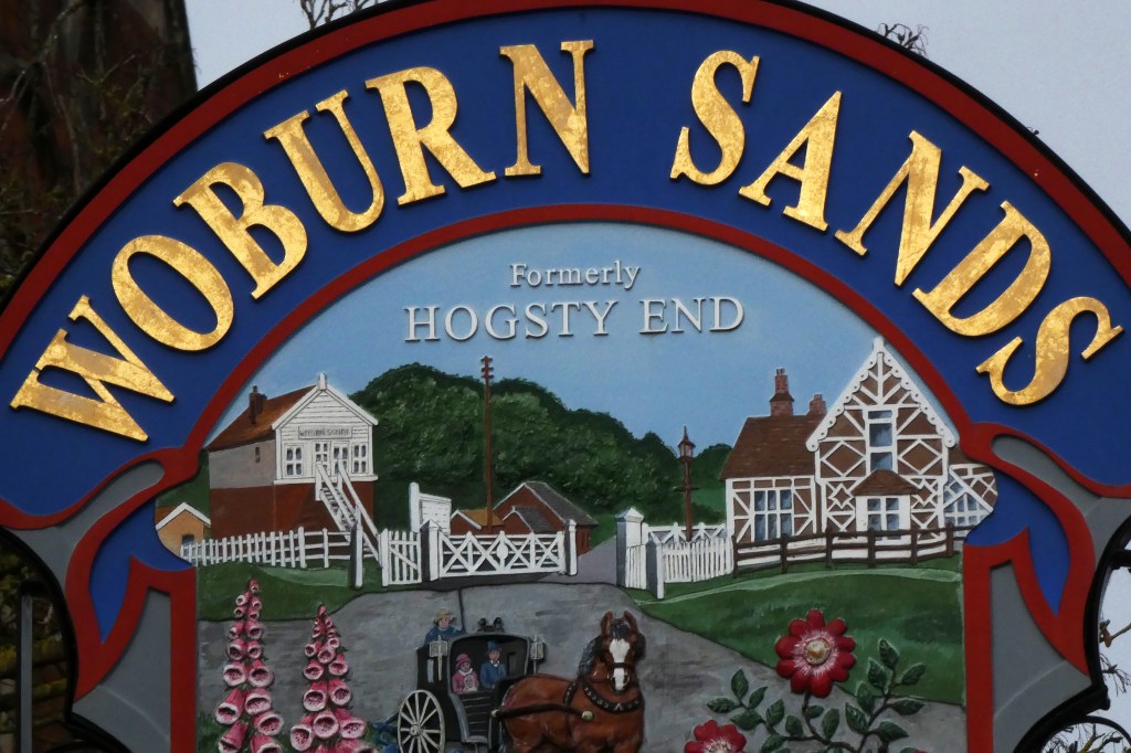
Image 1:
Location: The Institute, 6 High Street, Woburn Sands MK17 8SD. 52.01126,-0.64733
In the early 1900’s people travelled through the picturesque Hogsty End landscape on journeys from London, to Oxford and Cambridge. These travellers wanted services therefore hotels, inns, refreshment rooms, and souvenir shops became establishments. Many of these small businesses still remain, although the village has altered its name to be linked with its neighbour, Woburn for association with history. Due to this location being a popular tourist resort and association with wealth and tourism, the gold lettering on this sign captures that. Additionally the dusty serif letter plates display the popularity today from the pollution of cars passing through. Source
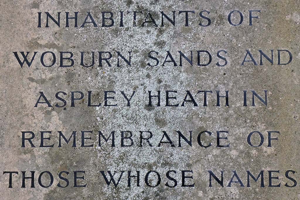
Image 2:
Location: High Street, Woburn Sands MK17 8SD. 52.01126,-0.64723
This stone cenotaph memorial displays engraved names of the missing or deceased from the first and second world wars, unveiled in 1919. The type on this piece is visually clear although the stone is showing signs of weathering and places of efflorescence. I have done some research on this particular style of lettering; and discovered Max Gill was commissioned to design the alphabet used on headstones and memorials (of the Imperial War Graves Commission) in 1918. The lettering is visually similar to Gill’s Roman inscriptions, most notably the letter a’s left tilting head serif and letter w’s central crossed apex. Source 1 and source 2
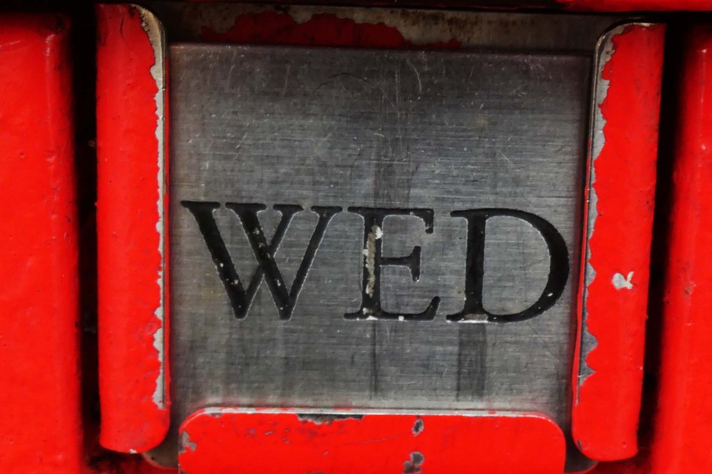
Image 3
Location: Club Lane, Woburn Sands, Milton Keynes, MK17 8RB. 52.01167,-0.64698
Royal Mail post boxes were introduced in the UK in 1853 with a tab function to inform people when post is collected. In 2003, 116,000 post boxes had their tabs re-instated after modern, detailed printed collection information sheets were placed on boxes. The tabs were re-introduced again following petitions in 2006, as the tab was deemed a functional requirement to the public – the design is relevant today and can’t be modernised. The scratches on the metal tab and worn etched lettering show the interaction with postal workers and weather over time, as does the chipped paint surrounding it. Source
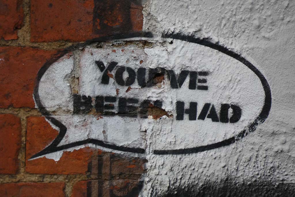
Image 4:
Location: Downham Road, Woburn Sands, Milton Keynes, MK17 8RB. 52.010769,-0.646510
This typography is part of graffiti art on the side of an exposed, busy building. The power of three words affects the tone of the art which is priest inside a brick frame, suggesting the viewer is being tricked into thinking the art is Banksy. The stencilled application appears to be rapid, as the paint has begun to flake off and isn’t sealed. Weathering has taken its toll on the letters, giving the distressed appearance of the sans serif’s blending together. The monochrome black and white scheme appears cartoonist and comical in contrast to its serious political message and artwork.
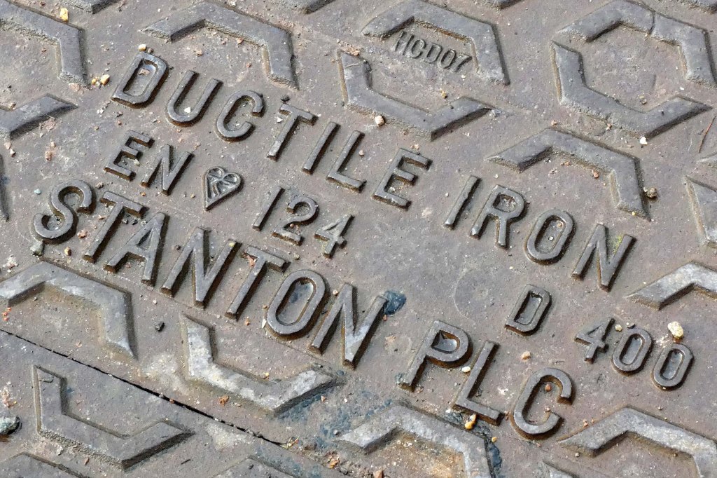
Image 5:
Location: 47 High Street, Woburn Sands, Milton Keynes, MK17 8QY. 52.01230,-0.64727
The village of Woburn Sands has evolved from a passing rural countryside destination with farms and wilderness, to a residential area with thousands of homes in over a century. During this time, industrialisation has thrived and this is demonstrated on the forefront of this cast iron cover with stamped sans-serif lettering. In addition, the kite-mark logo of BSI certification demonstrates quality and assurance. In order for cast iron to show signs of wear despite being so durable shows the dense popularity of this village; whilst also being functional for workers to identify the specific location from these letters. Source
