
Further research
Monotype – How type is adapting to the new normal
James Fooks-Bale hosted a half hour webinar on Monotype showing how type is adapting to be used digitally and shared some valid points so I have taken some notes and screen shares of his slides:
• Type is part of a recipe of a brand
• Consider how type looks on a screen, a brighter background
• Consider how data usage has increased by 47% since covid-19
• How does type consider size, perspective and scale?
• Being local and global – information available in familiar language
Taken from Ideas Wall: Cities, Manholes and Typography
1 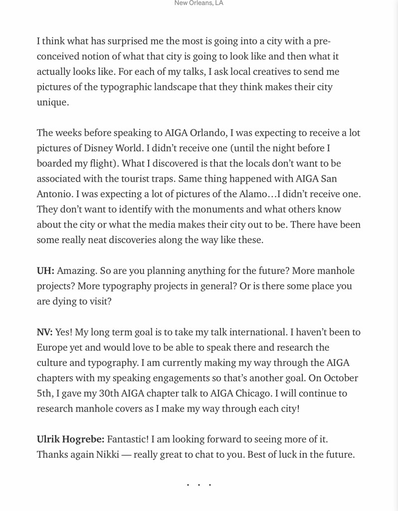
2
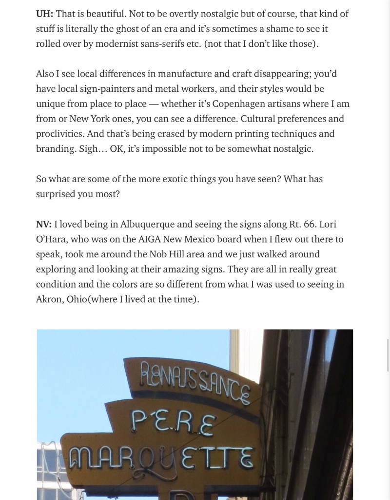
The image 1 paragraph about local differences in manufacture and craft disappearing is something I feel on the border with! I think it depends on a) where you look, and b) where you are. Craft is always going to be here and around in some shape or form, but in a different way. Whether that be manmade with technology or printing it is still a craft. I suppose our shift in society is how we perceive craft today. Just because technology exists does not mean craft is being lost; someone will have been behind the idea, the creation and the output. Even if lettering is made digitally someone has likely drawn and designed that by hand. Maybe Hogrebe means that there seems to be mass production and less one off pieces? I can understand this; with global networks so readily available to access it is inevitable that cultures will mix and designs will be mimicked throughout the world.
I also found it interesting in image 2 to hear people don’t want their home to be associated with tourism; they wanted their home to be unique and not known as somewhere where everyone has a preconceived idea of what it should be. For example, Disney has associations with childhood but in a way that is an entirely unrealistic perception of reality; and this is the power of successful branding. It takes over.
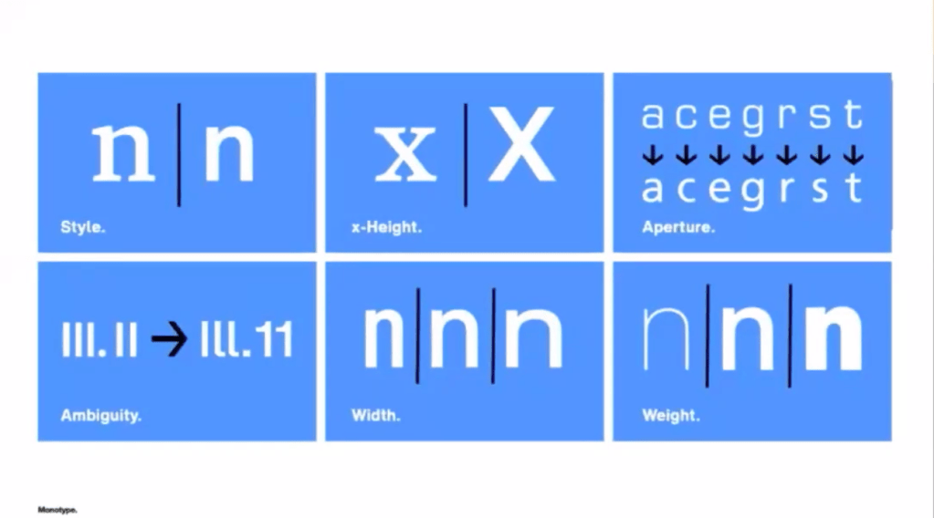
Lettering terms and anatomy
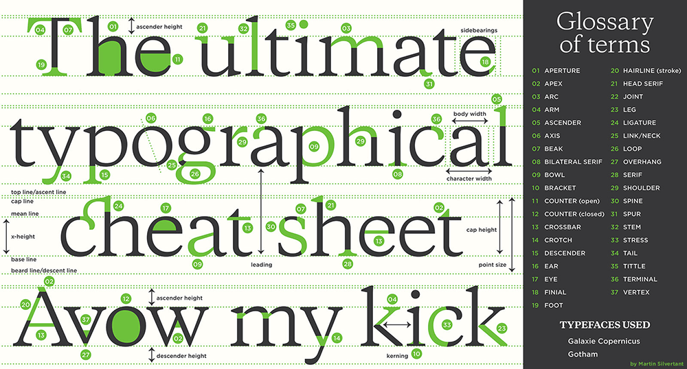
I found this cheat sheet above really useful for identifying tricky lettering terminology, specifically what it’s called when two lines cross in the middle of the letter ‘W’ in my photographs of engraved stone lettering – these are crossed Apex. It’s all these little flourishes that give a typeface personality and detailing that distinguishes it from all the other typography surrounding it. I will need to consider these for next week when designing my own typeface for my local area. I think it’s going to be a useful point of reference, especially as there seems to be lots of flourishes hinting at history in my area.
