
Reference Material
Edward Fella: Letters on America
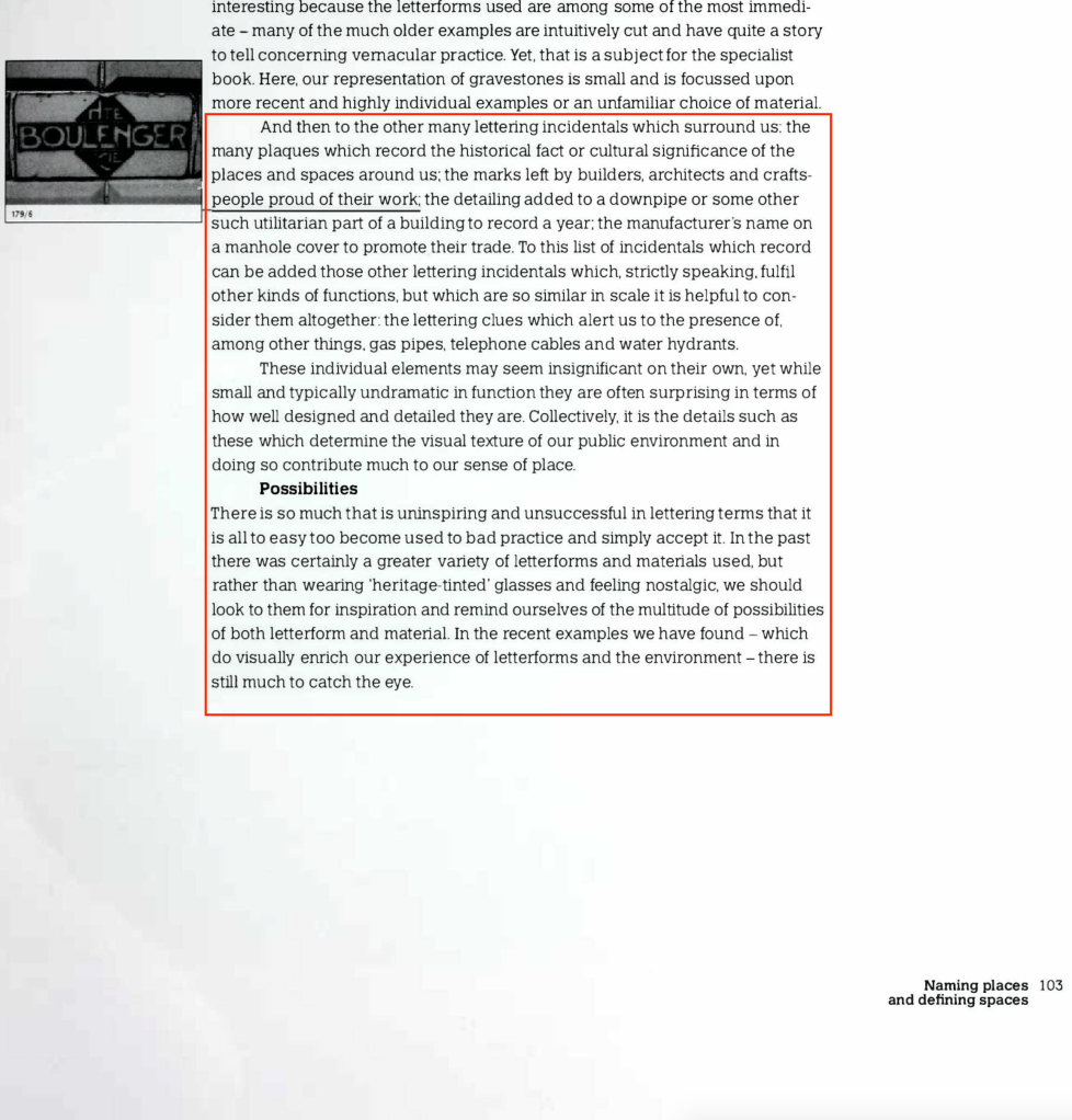
Fella is carefully looking at the bits that we would normally subconsciously erase – the irregular spacing, the unplanned juxtaposition of surface, the weathered image that sits next to an incongruous character. He finds and cherishes the events that make each sign unique, appreciating them not for what they say or for their historical significance, or for any programmed reason, but instead appreciating them for the thing he can use. That is all there is: ideas you might want to re-shape, recycle, reformat, or even occasionally revolt against.
Lewis Blackwell
Ed Fella’s style is a really wonderful approach to design. I absolutely adore his work and not just his colourful, vibrant drawings of lettering but his polaroid photography too. There is so much detail in the art and the photography, it makes me stop and look.
This article writes “…he subscribed to numerous magazines of art and culture. “He had a curiosity about everything,” says Nelson Greer, a design instructor at College for Creative Studies in Detroit who worked with Fella in the 1960s and ’70s.”. This informs me how Fella is generally inquisitive about the world around him. This is bound to shine through in your art as a creative person and goes to show that having other interests can not only motivate your drive and enthusiasm for design, but allow you to experiment. The way Fella’s work comes across is as though he has just sat down to draw with no idea what he would end up with; it’s just purely creative. Having this approach is refreshing and I wish we saw more of what happens in sketchbooks than the ‘perfect’ finalised outcome we see too much of nowadays.
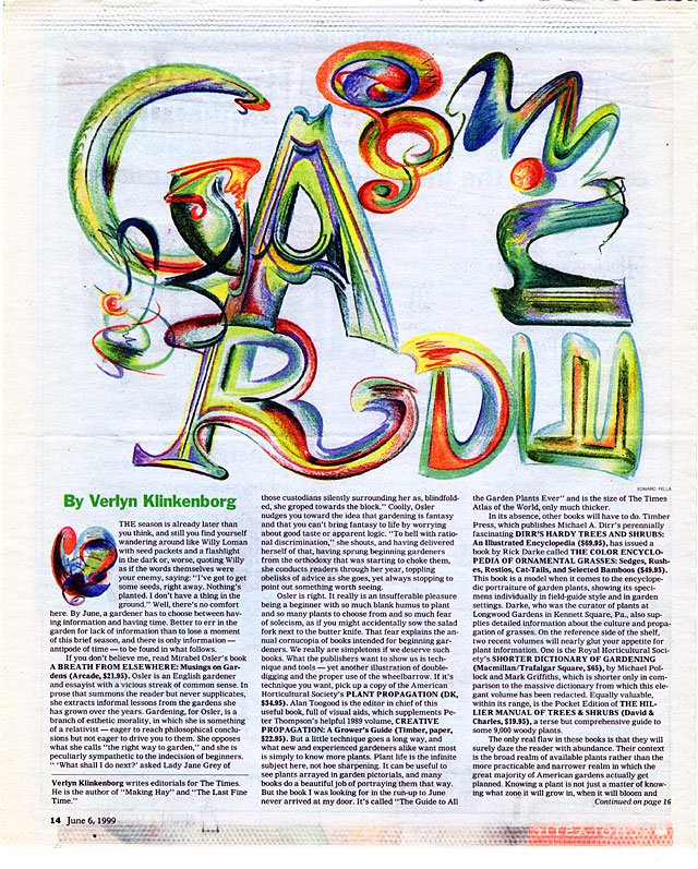
Lettering for NYT review 1999 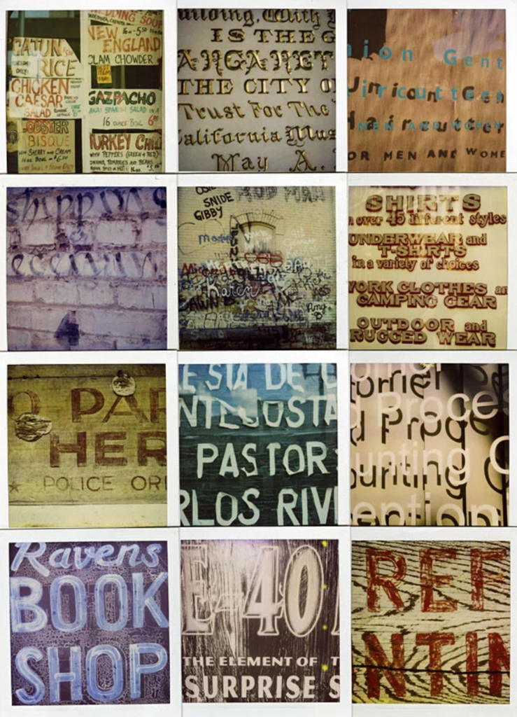
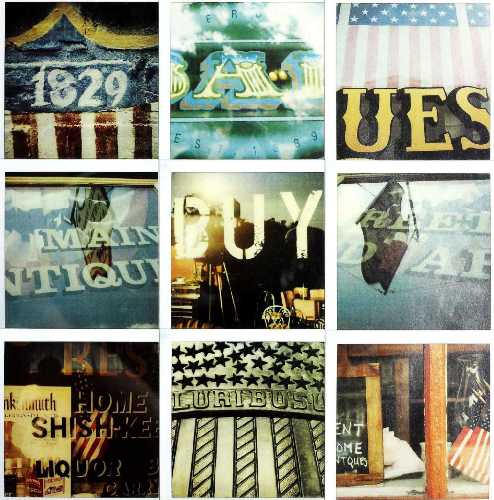
Polaroid photographs of lettering 1990-2005 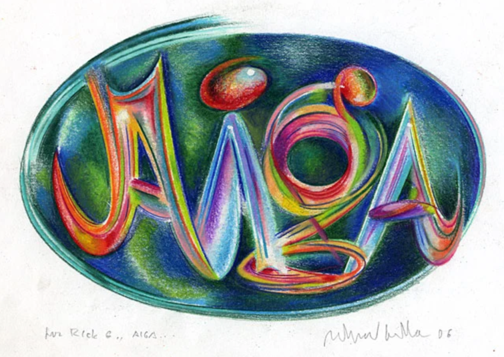
AIGA scholarship certificate 2006 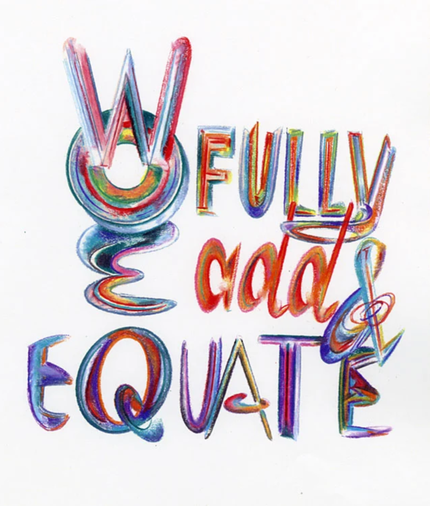
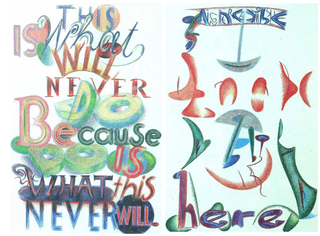
Sketchbook 2005
The polaroid lettering photographs above are inspiring. To see how shadowing can create depth and dimension, how texture can hide or reveal letters, how light hitting a metallic finish reflects and how the finish of the surface needs to be considered in a typographic outcome i.e. shop window. This will ultimately change how people perceive the lettering.
Signs, Lettering and Environment
1
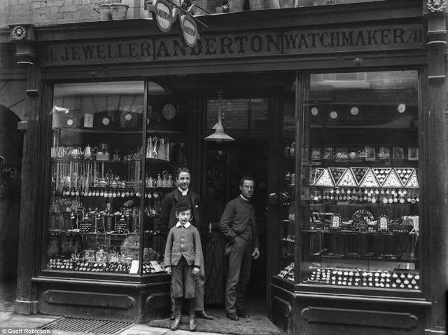
Reference image 1 – This section explaining how buildings change with time (in particular shop signs) made me want to explore examples of 19th century shop signs. This website provides a really great selection of shop owners and lettering on the forefront of shops (see below):
1 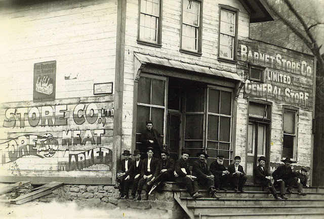
2 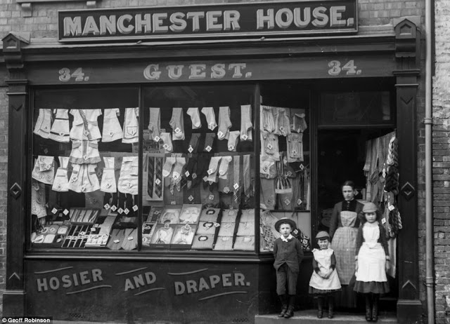
3 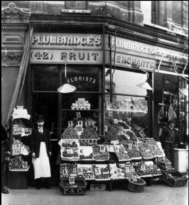
4 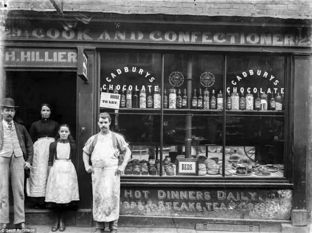
5
This is noticeably in contrast to today’s 21st century shops as they nearly all have logos and the company name. Numbers and shop owner names are now also not displayed on forefronts of buildings, more hidden away. It seems our modernisation of branding has resulted in much more simplified shop signage. I have found a good example of the evolution of a modern store – the co-op, and how it’s logo has changed over the last few decades:
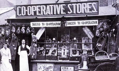
Source 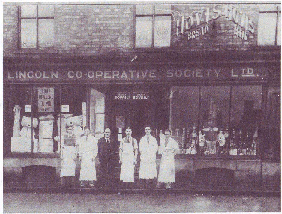
Source 
Source 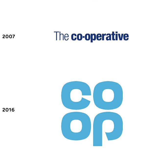
Source – the new logo uses the original colour palette 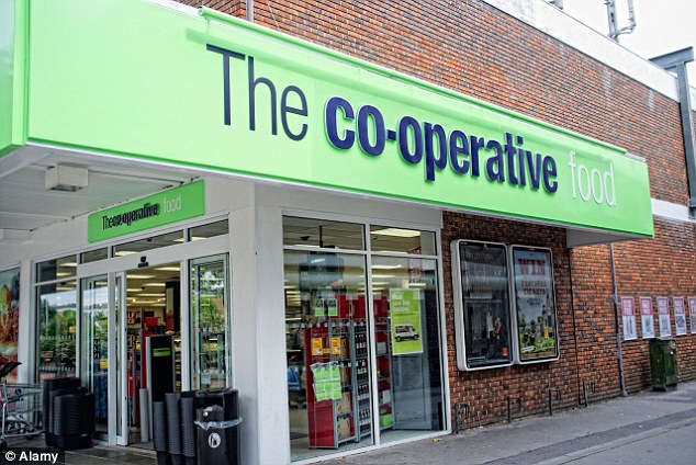
Source 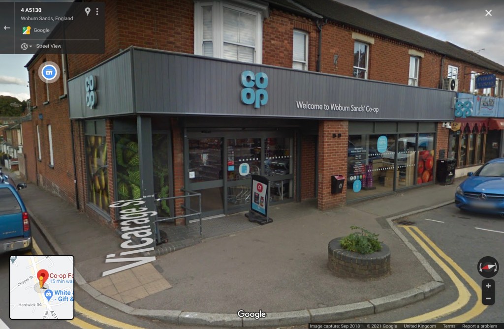
Google maps screenshot of my local co-op today
2
Reference image 2 – Completely relate to the statement about details in places such as drainpipes, manholes, electricity poles signs all adding to the sense of place. When I think of America for instance I almost always think about how much different the roads look to the UK – most importantly the signage. Same with Los Angeles, Canada etc. It’s a powerful tool to recognise location within the world, and that for me sums up the importance of the little typographic details in the industrial world.
Interview – Graphic Design Legend Massimo Vignelli
Before reading the article I wanted to look at images of the map design:
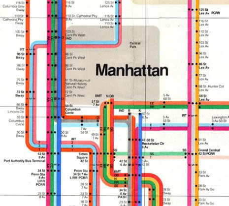
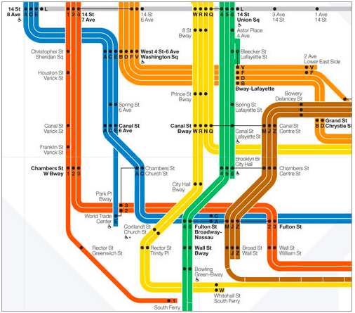
There are elements of the new map that remind me of the timeless London Underground (Johnston) map such as the white background and minimal colours.
Funnily enough there is a quote in the reference material above where Vignelli states: “I probably should have done what they’ve done in London—not have any indication of the geography. It’s a completely blank, white background so that there is no suggestion of geography whatsoever.” so I’m pleased that’s instantly what I noticed. It’s really great to see how other successful designers influence even those who are really successful, and elements can be taken from others to improve.
Some defenses need to be put up, and I think, actually, that the more culture spreads out and the more refined education becomes, the more refined the sensibility about type becomes, too. The more uneducated the person is who you talk to, the more he likes horrible typefaces. Look at comics like The Hulk, things like that. It’s not even type. Look at anything which is elegant and refined; you find elegant and refined typefaces. The more culture is refined in the future—this might take a long time, but eventually education might prevail over ignorance—the more you’ll find good typography. I’m convinced of that.”
Massimo Vignelli
I particularly wanted to highlight this quote as I feel that it’s really representative of how the world is changing; but more specifically how the digital world is opening up those barriers between form and function. Yes, there is still terrible type being made digitally but I think generally people have more of an understanding of how type impacts our daily lives now they are reading through screens. Unlike holding a newspaper you cannot simply zoom in on a screen without manually adjusting it (whether that be with fingers on touch screen or in the zoom settings) and I think that is eliminating the ignorance that people have had towards lettering and how important form and function surrounding that really is. People now understand due to having to adjust settings to read better digitally, just how important the right size, style, colour, positions etc. of typeface is on a page/document. Another role to consider in the digital world is if someone is holding one device that can display hundreds of pages, as opposed to holding a newspaper – that costs less. Therefore there is no reason for type to be condensed and poorly arranged digitally nowadays, like a newspaper page would have been, and so brands have more freedom to be creative and visually aware of their adverts. I think Vignelli is correct in saying that the future generations will be better educated about good type as its integrated into their daily lives much more.
